Discussion
Navigation
Discussion of our resultsValidation - public transport stops
Limitations of our methods and results
Improvements to be made
Acknowledgement
Discussion
The Index Score on different intervall scales is the final result for the combination proximities to all categories: medical institutions, shops, schools and public transports.
For the overall index score, the most limiting layer was the medical institutions. These data points were the fewest and are therefore making the biggest difference in contrast to the public transport stations. They are almost everywhere in close distance and therefore do not have a strong influence on the end result, even on low intervall scale.
Main finding: large spread of zones with perfect score. Mostly in a round shape, assumingly that there are locations where PTS, pharmacy, grocerystore and school come on a small area close to each other, like a small shopping centre close to a school for example. The produced map shows clearly where the city's most attractive spots are. They are well spread all over the map as it can be seen on the distance score layer with 250 meters intervall. The dark blue spots show zones with a maximum score. The spots seem to be distributed fairly randomly, as interpreted by the authors. They are present in every major part of the city centre and are not clustering. Though one might say that the closer to the used outline borders the dark blue zone gets less frequent. But they are present even out there. Thus there is a best classified zone in the Sihltal in direction of Adliswil, which shows that our indicator is not bound to closeness to the city. A location does not have to be in the city's inner core to end up strong on this index.
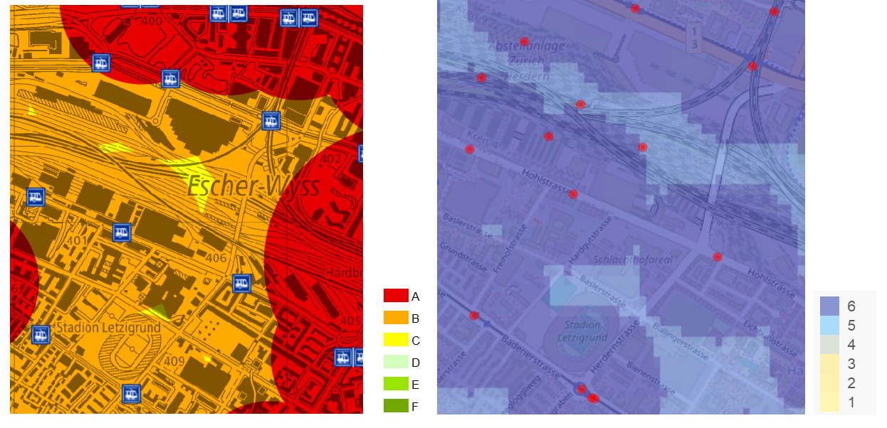
Validation - public transport stops
To validate parts of our results, we have looked at an existing classification of public transport services of the canton of Zurich [8]. They use the calculation method of the Federal Office for Spatial Development (ARE) which classify according to the distance to the stops, the transport public means (bus, tram, etc.), and the course intervall. We compared this to our map for the proximity to public transport stops for 250m intervall (figure 1). Overall, our results are similar: areas identified as slightly deprived (not within 500m) corresponds to the ARE ones (for ex. East of Hardbrücke or Wiedikon). But as we did not weight differently according to the mean of transport and course intervall, we are generally more generous and giving best score to more areas. Differences can be seen as shown on figure 1. We scored the area around the stops at Letzigrund stadium the highest, but not ARE, which scored it a category lower. These stations probably have a low course intervall.
Limitations
This study only takes into account the quality of life within the borders of the municipality of Zurich. But Zurich doesn't end at it's municipality borders and becomes country side. Here, in the case of Zurich, we are dealing with a fluid transition from the urban core to the agglomeration and eventually to a rural character. ccording to the city of Zurich, the agglomeration of Zurich comprises 150 municipalities with a total population of 1.3 million inhabitants in 2015[4]. The Federal Office for Spatial Development goes even further and defines the 'metropolitan area' of Zurich as having 221 municipalities and a population of 1.676 million in 2000, encompassing over 200 municipalities[5].
Furthermore, the goal of this project is to assess where in Zurich the highest quality of life is. But quality of life is a subjective term that varies among the perceptions of individual humans.It is very difficult to measure the quality of life, which can be divided into categories such as physical well-being, material well-being, social well-being, emotional well-being, and development and activity [6][7]. By choosing the four dimensions of PTS, schools, medical institutions, and grocery stores, the approach is simplified and does not consider emotional variables, for example. But again necessary for not overcomplicating the study. On the other hand because these four variables are all valued in distance meassure score, they stay easily comparable. Also, there has no been no qualitative differentiation inbetween the variables. All the grocery shops, schools, medical institutions, and PTS locations are given equal weight.owever, this represents a distortion of reality because a stop that is served by only one bus line is considered to be equally accessible as the main station in Zurich. Nevertheless, even though the assessment of the quality of life in Zurich has been kept simple, this glimpse into the spatial distribution of quality of life has been quite effective in detecting any inequalities within the city of Zurich. A study conducted by the federal agency of statistics examined the quality of life in eleven Swiss cities, utilizing nine different variables. While it does not delve into the spatial details of the cities as comprehensively as this study, it also takes into account emotional and economic variables [9].
It is important to note that the dataset used in this study might contain instances of missing data, where certain information is not available or incomplete. Further research should consider the possibility of missing data within the dataset and engage in some form of gap filling. It can affect the validity and generalizability of the conclusions drawn from the study.
The educational buildings layer, along with the hospital layers, condensed the zonal polygons representing school premises into a centrally located point. This raises the question of whether this influenced the results. We contend that it will have an impact on a larger scale, but given the chosen steps, the difference should not be perceptible.
Improvements to be made
To enhance the assessment of quality of life in Zurich, incorporating more complex variables can provide a more comprehensive understanding of the city's dynamics. While the currently used variables offer valuable insights, introducing more intricate factors can offer a deeper analysis. Consider integrating variables such as cultural amenities, environmental sustainability, and economic indicators like job satisfaction and income inequality. Additionally, assessing social factors such as community engagement and inclusivity would be beneficial. Combining the repertoire of variables in the study mentioned in the limitations and the spatial resolution of this study, could lead to ineresting results.
By incorporating these more challenging variables into the project, a more nuanced map of Zurich's quality of life can be created, enabling policymakers and stakeholders to make more informed decisions for the city's development and well-being. However, this may require a more elaborate scoring system and the consideration of weighted data within the variables. For example, giving public transport stops more weight in the assessment.
In order to design the website even more user-friendly, it would be benificial to improve loading times and potentially add a loading button or even a loading bar with loading updates to provide information on the loading process. Another improvement would be to remove the need to zoom out every time a different layer is selected, making the user experience smoother and more efficient.
To optimize the website for all users, it should be compatible with different browsers and screen sizes like smart phones, not just limited to Google Chrome.
Furthermore, it would be valuable to include data points outside of the boundary frame. Currently, the map only displays the distance to data points within the borders of the Zurich municipality, even if there might be closer ones just outside the extent boundaries.
Considering using different interval classes, as the 1000m interval may not have significant meaning on the scale of Zurich City. Adjusting the intervals can provide more meaningful and relevant insights. The 1000m interval could be used when extending to the agglomeration area of Zurich.
Acknowledgements
To build our website, we got help from different sources:
- w3schools.com: examples of codes in HTML and CSS
- leaflet for R
- R shiny tutorials
- projects from last years
The main framework of the website has been taken from the project of Spring semester 2022 "Mental Health" as a basis, and then reworked completely to fit our needs and likings. The elements we really liked about and that we kept were: the top menu, where we adjusted style and the categories, the footer: we chose another color which we thought was more accurate to our theme, as blue makes think of Zurich (flag). The top button: very useful script, not touched. The police: friendly and sans serif, which makes reading easier.
We would also like to thank Prof. Dr. Sara Fabrikant for her teaching and supervising during this project that took place in the frame of the GEO454 Geovisualization course at the University of Zurich, as well as Corrado Muratori (PhD) for his assistance during the course.