Discussion
- Which pollutant is most prevalent in countries with a high death rate?
- Has the mortality rate reduced due to the decreasing amount of pollutants in the air?
- Does a high death rate imply high pollutant values? Or respectively a minimal rate for low values?
- Limitations
The Table 2 below lists the countries with the highest annual death rate recorded since 1990. The table shows the death rate the countries recorded on their record year and the normalized emissions in ton/km2. The pollutant most present in all the countries appears to be CO, which is not directly related to lung cancer. Second most present pollutant is NOx, which is both directly and indirectly related to the risk of developing a lung cancer (Gawelko et al., 2022; Xue et al., 2022). The PM2.5 and PM10, which are the pollutants more strongly associated with the cancer are not the most emitted pollutants, but as remarked by Yorifuji & Kashima (2013) there is not safe threshold for those compounds, therefore those values may still be very relevant. It has to be noted that while the thresholds are defined in micrograms per cubic meters, our data are the emissions in Gg per year, that we then normalized with the countries area. Therefore, from our values we cannot directly derive the concentration of pollutant in the air and compare it with the WHO defined thresholds to see how much those values differ from the proposed reference values.
However, for the countries of Hungary, Croatia and Greece, that had their maximal recorded lung cancer death rate in approximately the same period (2016-2017), it can be noticed that the higher are the values for the PM pollutants, the higher is the death rate.
In general, by looking at the map, the trends are not always clear. It can be noticed that the Hungary, which shows the major death rate in most of the years does have high values for SOx and PM in the 1990s and early 2000s, as well as Belgium, Greece and Slovakia, which also have high death rates. On the other hand, Poland shows quite high values on the same pollutants but its death rate is notably smaller than the ones of the aforementioned countries and only on the second half of the 2000s begins to have a similar death rate to Belgium ad Greece. Further, can be seen that Denmark and Germany, despite having similar level of ton/km2 for pollutants as PM10 and NOx, have quite different death rates, with Denmark being strongly affected by lung cancer than Germany. Also, can be noticed that for all countries the general trend is that while the pollutants emissions have diminished in the course of the years, the death rate tend to increase or remain stable.
| Country | Year | Death rate | CO | NH3 | NOx | SOx | NMVOC | PM2.5 | PM10 | TSP |
|---|---|---|---|---|---|---|---|---|---|---|
| Hungary | 2016 | 90.5 | 4.927643 | 0.8182951 | 1.318275 | 0.2519429 | 1.387382 | 0.5414767 | 0.7700236 | 1.1091936 |
| Croatia | 2017 | 72.6 | 4.547709 | 0.5751130 | 0.9806773 | 0.2231560 | 1.229880 | 0.5260112 | 0.6807619 | 0.9154298 |
| Denmark | 2006 | 69.6 | 10.276482 | 2.228725 | 5.031816 | 0.7638203 | 3.752328 | 0.5496726 | 0.8308599 | 2.382481 |
| Belgium | 1997 | 67 | 36.579764 | 4.528770 | 12.647359 | 7.4494092 | 9.407396 | - | - | - |
| Greece | 2017 | 66.7 | 3.827776 | 0.4932170 | 2.076349 | 0.7010434 | 1.171074 | 0.3100874 | 0.5244365 | 0.9318297 |
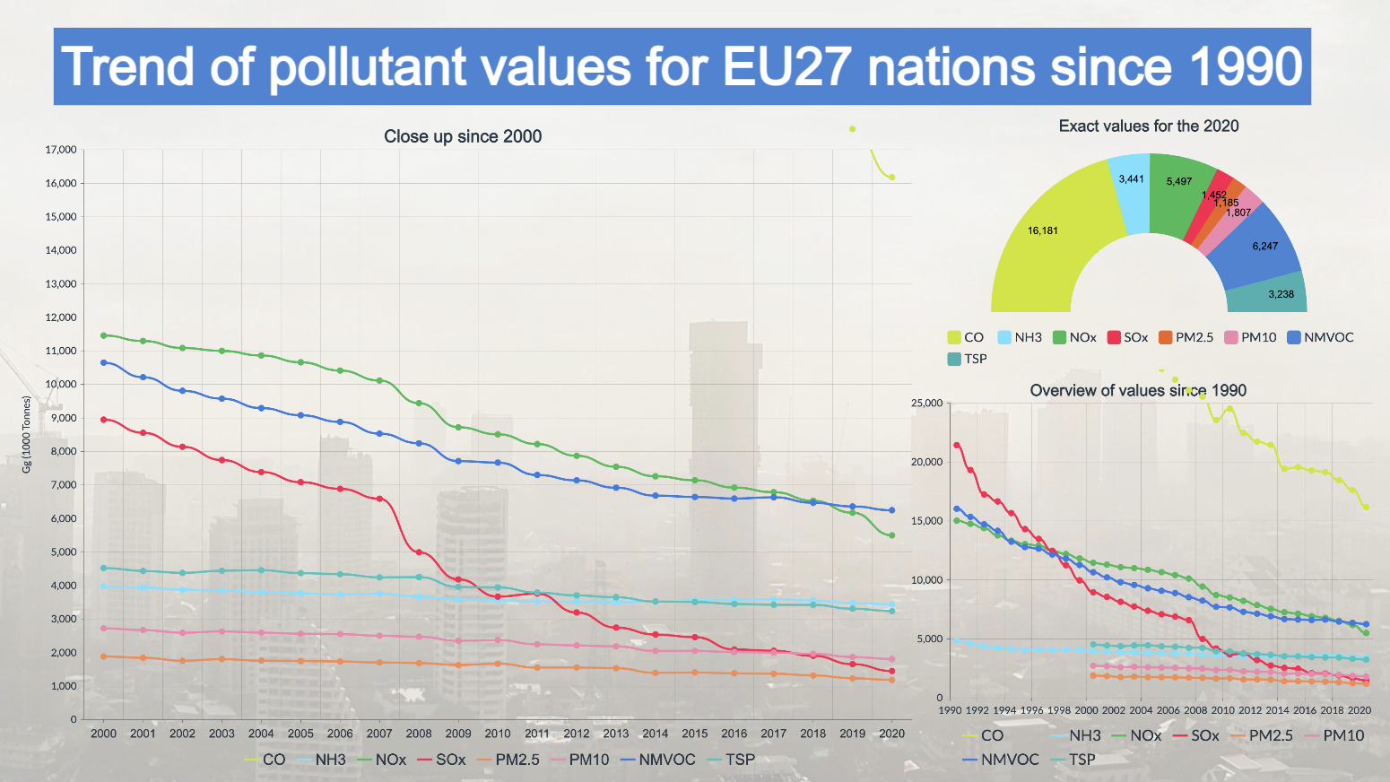
The two graphs show trends for the whole of EU27 countries for both the pollution values of individual pollutants and the death rate. From the first graph, a general decrease in pollution can be observed. Especially the values of NOx, SOx and NMVOC show a strong downward tendency. CO shows an extreme case in that it experienced a huge decrease from a value of 56690.95 Gg in 1990 to a value of 16180.68 in 2020. Finally, the values of PM, NH3 and TPC are too decreasing, but with a considerably flatter trend.
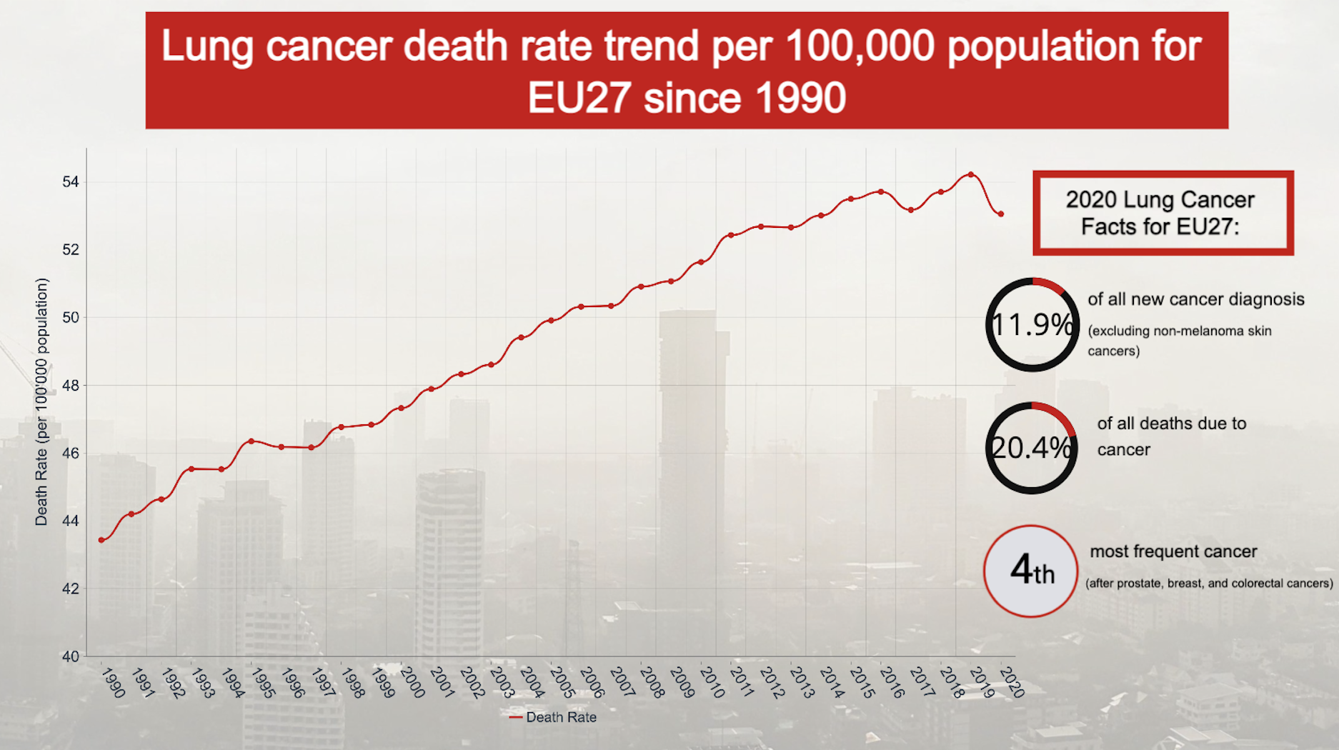
With regard to the trend in lung cancer mortality rates in Europe, depicted in the second graph, there is an increase: from a value of 43.4 in 1990 to a maximum value in 2019 of 54.2. In 2020, the value dropped to 53. This trend does not reflect exactly what was expected, as with a decrease in air pollution, we would have assumed that we would also see a decrease in the death rate. However, the result is not necessarily wrong with our expectations since the latency period for lung cancer varies from about 10 to 30 years. This means that the effect of a decrease in air pollution can only be seen in the lung cancer data many years later, and the graph therefore represents the consequences of the exposure the population has experienced in the past decades. A possible confirmation could be the 2020 data showing a decrease, which could possibly persist in the following years. Thus, an analysis of future data would be useful to confirm the decreasing trend. However, it is also important to note that there is a possibility that the lower figure for 2020 could be due to the COVID19 pandemic, during which deaths were perhaps categorized as due to the virus rather than directly attributed to the lung cancer. Finally, it has however to be remarked that the air pollution is only one of the risk factors that could lead to the onset of lung cancer, since other relevant factor are smoking, passive smoking, occupational exposures, radon, and established carcinogens (Lipfert & Wyzga, 2019). Therefore, the current lung cancer death rate trend may be more influenced by those other factors than the air pollution.
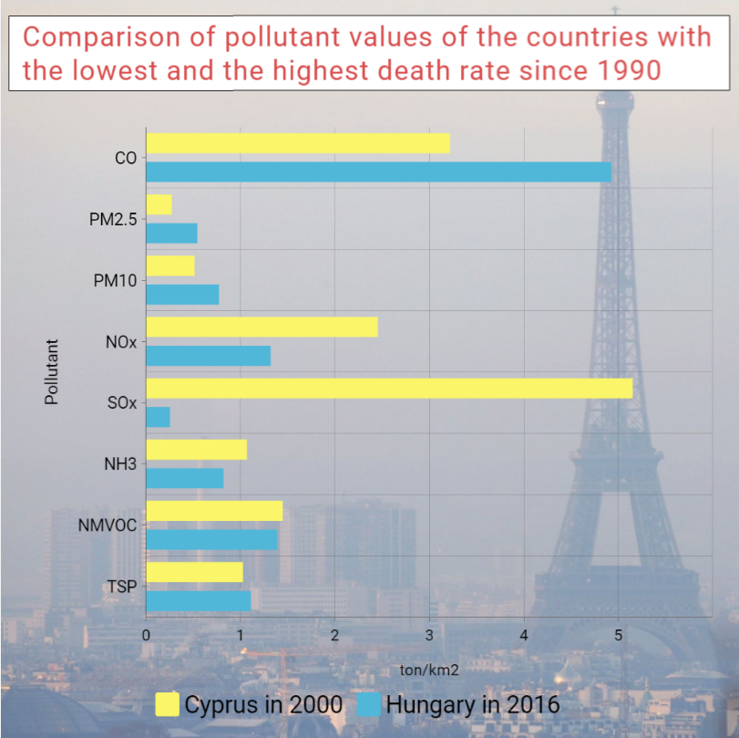
In the Figure below, a comparison of the pollutant emissions between Cyprus in 2000 and Hungary in 2016 (respectively the country the lowest death rate since 1990 and the one with the highest) shows that while Cyprus had lower emission in PM, which are the more relevant pollutant in relation to lung cancer, on the other hand for NOx and SOx it had significantly higher values. This could indicate that PM are a much more relevant factor for the lung cancer. Also when looking at the pollutant history of the two countries, Cyprus has smaller emissions of PM and smaller death rate despite having usually higher emissions of NOx and SOx.
Finally, it is important to state that cancer has a long latency period, which ranges in the timeframe from 10 to 30 years (Lipfert & Wyzga, 2019), so current cases mostly reflect past exposures. As seen in the graphs of trends in the amounts of pollutants in the air for the last 30 years, it can be observed that there is a certain but very slight decrease in values (except for CO values). On the other hand the cancer trend seems to still be increasing. Therefore, it is not possible to make statements on the available data, whereby an analysis of future trends in death rate from lung cancer could reflect the decreasing trend in pollution.
Finally, some remarks on the limitations of this project have to be made. The dataset for pollution has the pollutant expressed in yearly emissions for the whole country, that we normalized by dividing it for the area of the country. However, the pollution is not distributed equally on the whole country, but its density varies depending on the degree of urbanization or other sources of pollution. Furthermore, the air quality is usually measured in micrograms per square meter. This is a limitation of our project, since we miss small scale phenomena. It could be assumed that cities have higher pollutants emissions and concentrations than the countryside, thus leading to higher incidence of lung cancer on those areas. Knowing the degree of urbanization and urban resident population may thus help to better explain the distribution of lung cancer death rate in relation to pollution.
Another limitation is that cancer have a latency period, meaning that the onset of cancer occurs after a long-term exposure. Therefore, the number of cases and the death rate of one year are the result of the exposure the population experienced during the past years. However, on the map this delay cannot be shown, since for each year are displayed the death rate and pollution emissions of that year, thus missing this important temporal link between present cancer burden and past emissions. Since the time required for the onset of cancer could greatly vary, is also difficult to relate a single year to another year in the past.
Conclusions
While the trend of pollutant emissions in the European countries have shown a decrease in the course of the past three decades, the death rate of lung cancer still show a clear increase in most countries. This could be due to the long latency period of cancer, thus the consequences of the improvement of air quality are still not visible in the cancer death rate. From our visualization, a clear relationship between pollutant emissions and lung cancer death rate is not always clear, even though there are indication that higher emission may lead to higher death rate. Furthermore, since the lung cancer has other causing factors, could be that the visible trend is more due to the influence of those other factors, such as the smoking of cigarettes. Further studies on the visualization of lung cancer death rate and air pollution may beneficiate to also include data on the percentage of smokers in the population of the country, the urbanization degree of the country as well as to consider other dataset to analyse pollution, for instance with higher granularity or city-based datasets.