
Method
Data Collection and Preprocessing
The first step of our project was to look for fitting literature and accompanying data. The selection of fitting literature, influence factors for living space selection and user groups was already thematised in the chapter 'Background ' . In the following text, the datasets that were chosen for each factor are shortly presented. To facilitate the index implementation, all factors were classified as negative or positive.As ground data for the implementation the geometries of Zurichs municipalities were used (Amt für Raumentwicklung Stadt Zürich, 2023).
The link to each dataset can be found in the ' Literature ' section.
National Traffic Model (NPVM)
Source: Bundesamt für Raumentwicklung (2023)
The first dataset stems from the National Traffic Model (dt. Nationales Personenverkehrsmodell). The dataset provided ground data for 3 of 5 variables (
For each zone the travel time to the closest centre of national importance by street transport and by public transport (
For
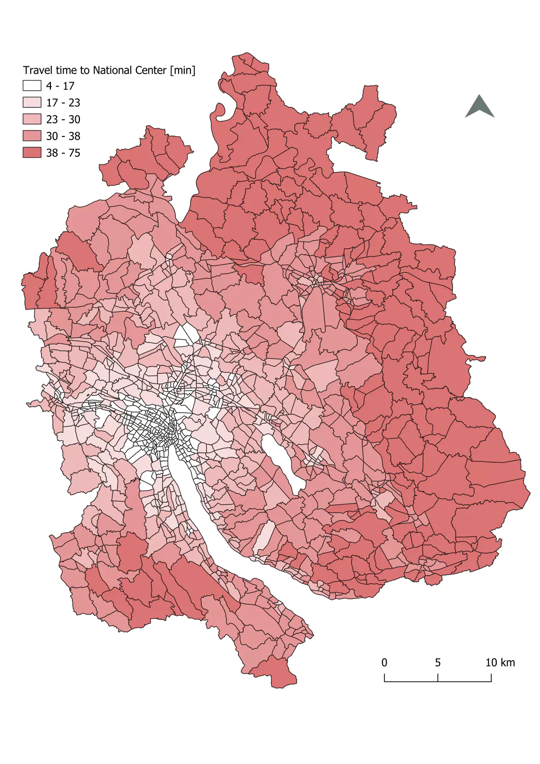 Visualization of minimal travel time to the closest
national centre with
Visualization of minimal travel time to the closest
national centre with
either public transport or by street (Bundesamt für Raumentwicklung, 2023).
Source: Bundesamt für Raumentwicklung (2023)
The first dataset stems from the National Traffic Model (dt. Nationales Personenverkehrsmodell). The dataset provided ground data for 3 of 5 variables (
F1
Travel time to the next centre with
nationwide significance
-
F3
Travel time
to the next centre with regionwide significance with public
transportation
)
and therefore had a high influence on the outcome of this
project.
The dataset is made up of traffic zones, that were
calculated from the density of work places and housing
possibilities (for more information please consult the cited
report).
For each zone the travel time to the closest centre of national importance by street transport and by public transport (
F1
Travel time to the next centre with
nationwide significance
),
the travel time to the closest agglomeration or central
municipality (regional centre) by street transport
(F2
Travel time to the next centre with regionwide significance by street transportation
)
and the travel time to the closest regional centre by public
transport (F1
Travel time to the next centre with
nationwide significance
) are given.
For
F1
Travel time to the next centre with nationwide significance
, the minimal travel time to the closest centre of
national importance was chosen. Then the dataset was split
into those three attributes, of which each was cropped to
the extent of the canton of Zurich and rasterized for
further calculations. F1
Travel time to the next centre with
nationwide significance
- F3
Travel time to the next centre with regionwide
significance with public
transportation
were treated as negative
influence variables.
Visualization of minimal travel time to the closest
national centre with
either public transport or by street (Bundesamt für Raumentwicklung, 2023).
Tranquility map of the swiss midlands
Source: Leeb et al. (2020)
The tranquility map was created by researchers at the ETH Zurich and shows how tranquil a place is. The researchers therefore considered several variables like noise exposure, closeness to infrastructure or landscape quality. The raster was used for calculations regarding
Unfortunately, two municipalities already lie in the pre-alpine region of Switzerland and therefore were excluded from our results, as no tranquility values for those municipalities were provided.
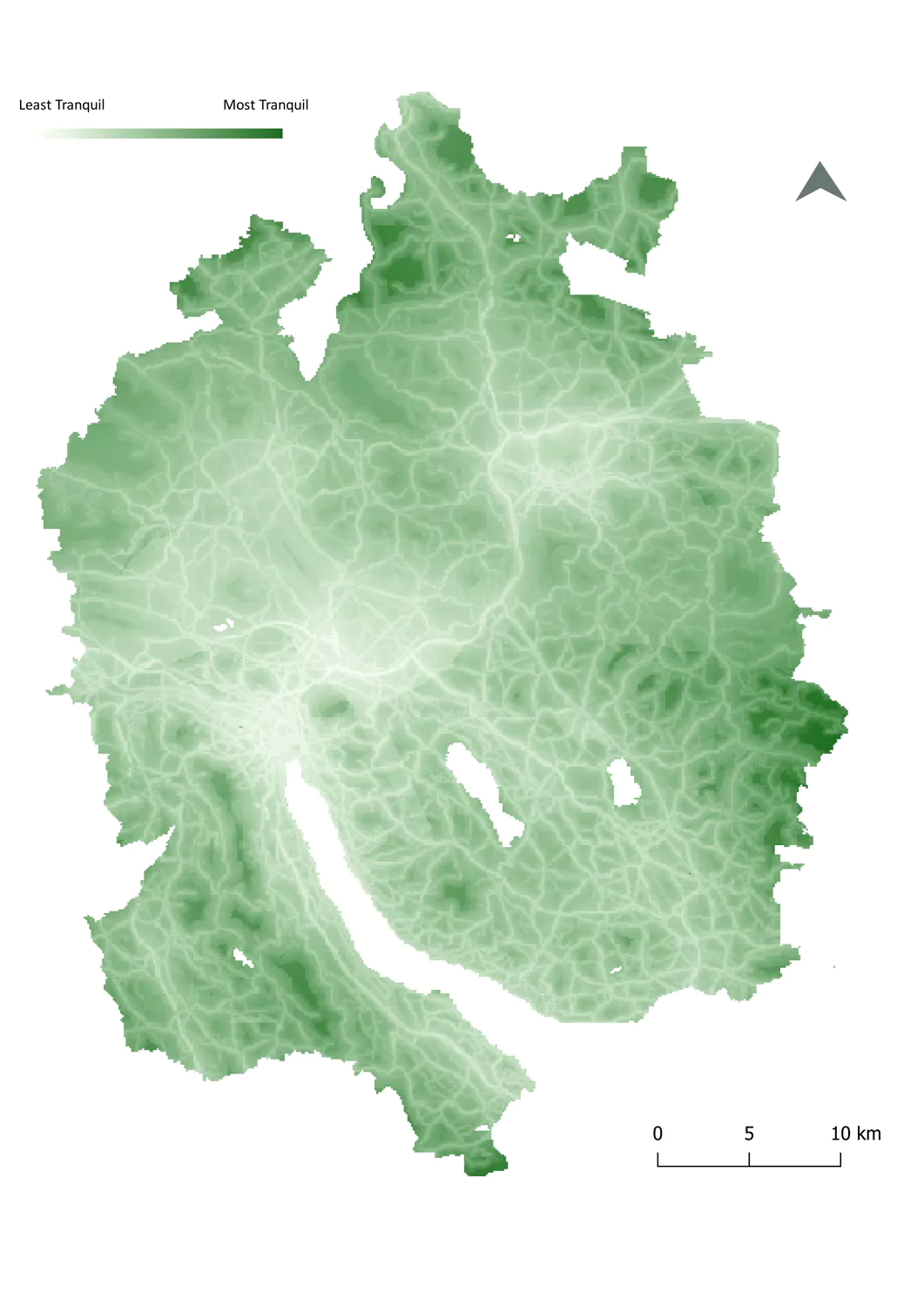 Visualization of tranquility in the canton of Zurich
(Leeb et al., 2020).
Visualization of tranquility in the canton of Zurich
(Leeb et al., 2020).
Source: Leeb et al. (2020)
The tranquility map was created by researchers at the ETH Zurich and shows how tranquil a place is. The researchers therefore considered several variables like noise exposure, closeness to infrastructure or landscape quality. The raster was used for calculations regarding
F4
Tranquility of a place
. The pre-processing
limited itself to cropping the raster to the extent of the
canton of Zurich.
Unfortunately, two municipalities already lie in the pre-alpine region of Switzerland and therefore were excluded from our results, as no tranquility values for those municipalities were provided.
F4
Tranquility of a place
was treated as a positive
influence variable.
Visualization of tranquility in the canton of Zurich
(Leeb et al., 2020).
Share of unemployed residents
Source: Statistical Office of the Canton of Zurich (2023)
The last dataset used provided the share of unemployed citizens per municipality. The dataset only consisted of a CSV, which then was linked to the municipality's geometries by a join. Other than that, no further pre-processing was necessary.
The simple map on the right shows the data after being linked to the geometries.
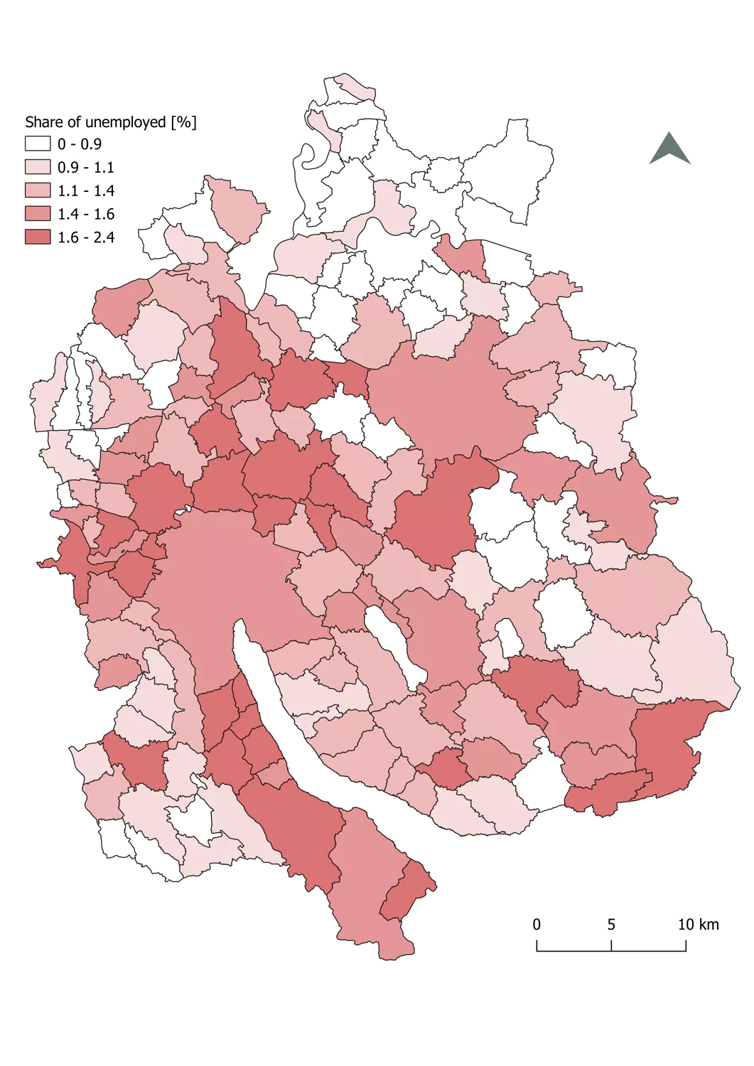 Share of unemployed citizens in % per
municipality
(Statistical Office of the
Share of unemployed citizens in % per
municipality
(Statistical Office of the
canton of Zurich, 2023)
Source: Statistical Office of the Canton of Zurich (2023)
The last dataset used provided the share of unemployed citizens per municipality. The dataset only consisted of a CSV, which then was linked to the municipality's geometries by a join. Other than that, no further pre-processing was necessary.
F5
The image of a municipality, measured by the share of unemployed inhabitants.
was treated as negative influence variable.
The simple map on the right shows the data after being linked to the geometries.
Share of unemployed citizens in % per
municipality
(Statistical Office of the
canton of Zurich, 2023)
Data Processing
In the next step the layers were created using QGIS and ArcGIS Pro. This section briefly describes all steps that were taken for the index implementation.1) After the rasterization of the datasets, all of the datasets below were normalised between 0-100. Thereby the score 100 was given to the highest values in the dataset, and 0 to the lowest.
Example: The pixel with the furthest distance to a national centre was classified as 100 in the negativ influence variable 'Distance from a centre with national significance'.
2) The next step included the calculation of the index for each of the user groups, by multiplying each factor by its weight (positive influence variables) or by its negative weight (negative influence variables). All of the layers were summed up and divided by the number of weights. This resulted in nine raster layers with the index numbers for each group.
3) As the goal was to have an index for each municipality, the raster layers were aggregated to the municipalities. Each municipality feature received the mean of the index numbers within its area. From this step nine vector layers, one for each user group, resulted.
4) The calculated index numbers are not yet interpretable, as they are still absolute. The final index is meant to be a relative assessment of a municipality's suitability as a living space for a certain user group, respectiv to all other entities in the target area. Therefore, the numbers had to be classified. While Fahrländer et al. (2014) decided on six classes, in the here presented approch only five classes were chosen. Three classes did not seem to display all necessary nuances. As a neutral class seemed to be useful, five classes appeared to be the best choice. As classification method 'equal interval' was chosen. From this step the first set of result layers with a Living Space Quality Index (LSQI) per municipality and user group emerged. The maps are visible in the 'Map ' section.
5) In the last step, the Diversity Map was created. It consists of the mean LSQI of all user groups and each municipality. The Diversity Map is visible as the last layer in the dashboard of the Map section.