We created an interactive map and two time series animations to analyze our research questions. The first map is a dashboard showing the global pattern of national poverty. Additional graphics for each country show the income inequality as the GINI index and the temporal change in GDP and extreme poverty over time. In the animations the global pattern of temporal development of extreme poverty and GDP per capita are visualized. The time series cover the time from 1990 to 2019.
Important concepts
The national poverty rate describes the percentage of the population that lives below the national poverty line. This poverty line varies between countries as it describes the income needed to meet all basic needs of life. Estimations of food costs based on consumption habits and the availability of food in the country and the relative prices are considered. Additionaly, the resources needed besides food are also taken into account.
The data is collected in household surveys (World Health Organization, n.d.).
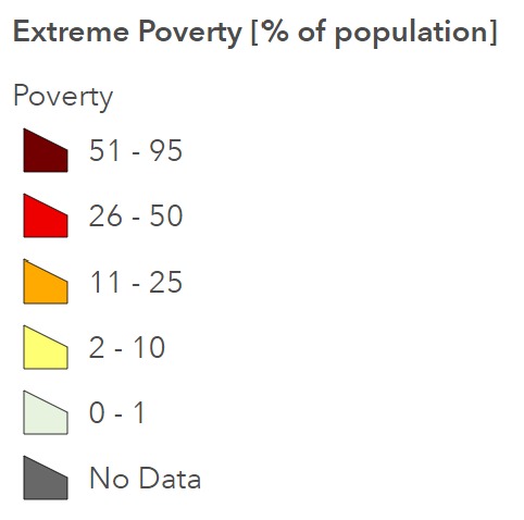
Defined by the World Bank, which belongs to the UN, those living with less than $1.90 per day are living in extreme poverty. Dollar in this case is the international dollar which considers the varying purchasing powers in each country. It measures the monetary value of an individual’s consumption. In countries where data about consumption is not available, income data is used instead (Roser and Ortiz-Ospina, 2013).
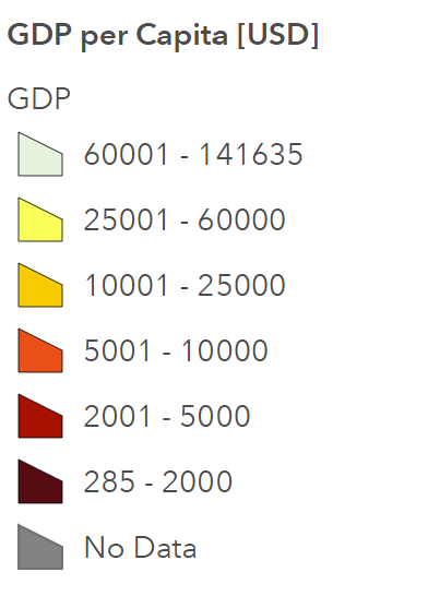
To measure the economic wealth, the gross domestic product (GDP) per capita was chosen for this project. It measures the monetary value of the total production of all goods and services in an economy. To be able to compare countries of different sizes, the GDP normalized to the population size, is used (Roser, 2013).
The GINI coefficient is a measure of inequality and shows the extent to which the income distribution of a country deviates from the perfectly equal distribution. Income inequality is reflected in the share of revenue accumulated by a portion of the population ranked by their income levels. The portions ranked lowest by personal income receive the smallest shares of total income. Visually, the further the curve differs from the line of equality (Lorenz curve x=y), the more unequal the income distribution. The Gini Index can be calculated with the area between the Lorenz curve and the income distribution divided by the whole area under the Lorenz curve. Therefore, the larger the difference between the two curves, the higher GINI index. Consequently, a country where everybody earns the same amount of money, would have a GINI index of zero (or 0 %) and a value of 1 (100 %) would represent a country where one person earns everything and everybody else nothing (The World Bank, n.d.).
How to use the dashboard
To navigate around the map use the zoom-tool and pan. The home button brings you back to the initial extent. With the search function you can search for specific countries. The legend for the map is accessible in the tool in the top right corner of the map. To get additional information about a country, use the select tool in the top left corner and click on a country. Dynamic infographics specific to that country will show up and hovering on the graphics shows the exact values displayed.
Be aware that in case of inaccurate selection, several countries can be displayed in the graphics.
For a better overview of the global situation from 1990 to 2019, the time series of extreme poverty and GDP is visualized in the animations below. Use the time slider to go through the video or use the play and pause buttons. With the three dots you can adjust the playback speed and download the video.
Time series of extreme poverty from 1990 to 2019
Time series of GDP per capita from 1990 to 2019
Data uncertainty
Poverty & income shares:
The data about extreme poverty is accessed through Our World in Data but stems from the World Bank database. Directly downloaded from the World Bank, the data set is due to unknown reasons much more incomplete. The indicator of both national and extreme poverty is collected in household surveys, which have seen large improvements in the past few years, but the recency, frequency, quality and comparability of such surveys remain a challenge and uncertainties need to be taken into consideration in the analysis. Especially in low-income countries and countries in fragile situations data is often lacking which causes uncertainty about the development of the poverty rate. Additionally, the consumption the poverty indicator is calculated upon does not always account for nonmarket goods from own production (Roser and Ortiz-Ospina, 2013).
The income shares by quintile of population used for the inequality indicator (GINI coefficient) are also collected by household surveys and therefore face similar uncertainties (Roser and Ortiz-Ospina, 2013).
Country wealth:
The GDP is combined with population data to make it comparable between countries of different sizes. Both GDP and population data face major differences in data quality and combining them further increases these uncertainties. Possible sources of inaccuracies in GDP estimation are on the one hand the underestimating due to the lack of national statistics offices and the unrecorded informal economy and on the other hand in some cases overestimation as a result of government interference (World Economics Research, 2022a). The data quality of population differs widely between countries and census data is on average collected every 10 years. For the years in between, the total population and demographics are only estimated and the accuracy of it depends on the coverage and time since the last census and the registration of births, deaths and migration, which is a challenge in many developing countries (World Economic Research, 2022b).
GDP is also not an ideal measure of economic well-being as it excludes the informal sector and does not take into account any changes in natural capital or if the growth is sustainable or not (Cha, 2013). Despite this it is used because the global spatial and temporal availability of data is comparatively very good.