Map of Pacific islands
The first map shows a general overview of the situation of the islands in the Pacific region, while the second map deals with linguistic diversity. The following image serves as an explanation on how to interact with the maps.
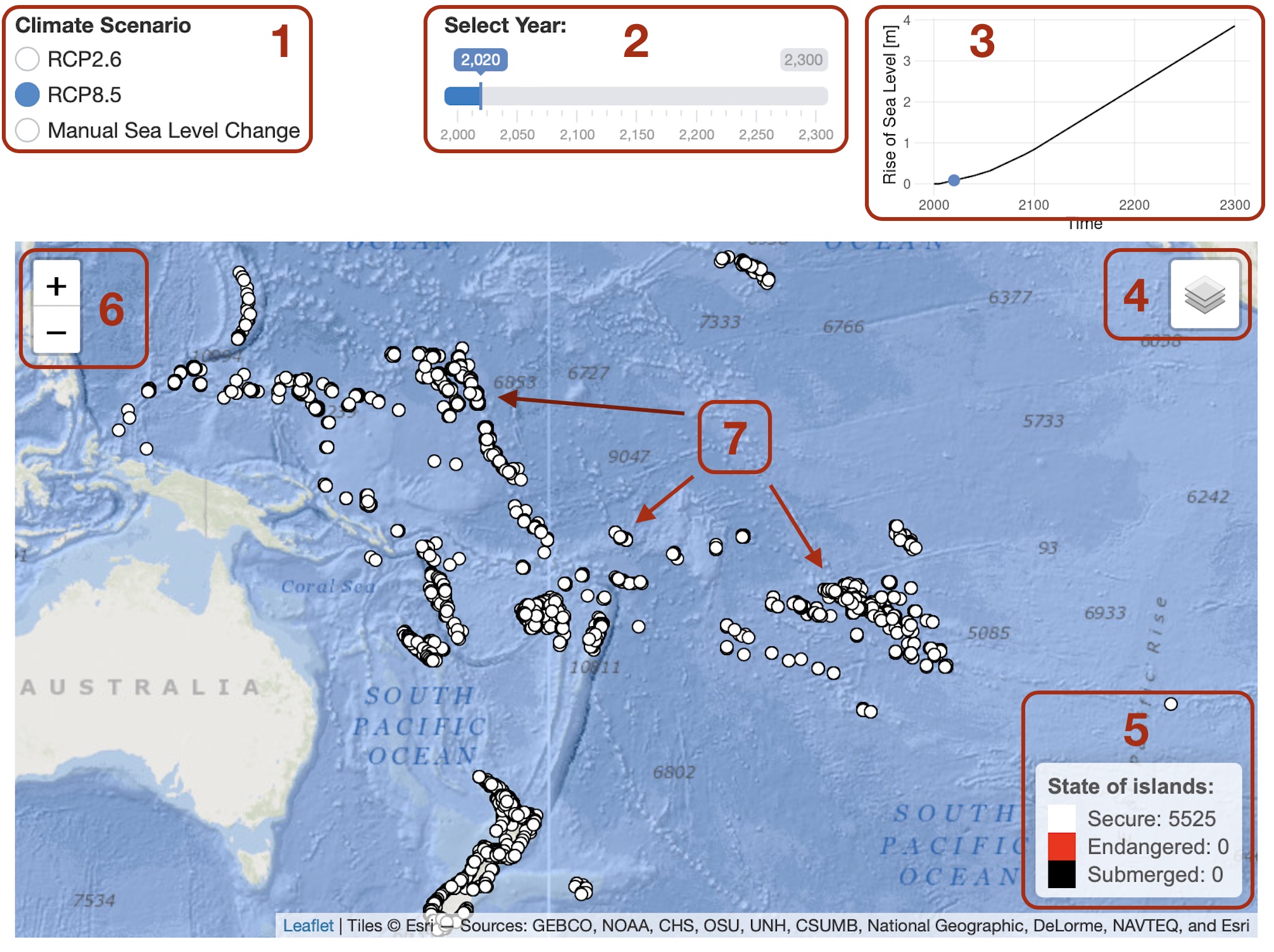
Map Interaction
- Allows you to choose a representative concentration pathway (RCP). Different RCP’s are used by the intergovernmental penal on climate change (IPCC) to model a variety of future climate scenarios. The RCP8.5 scenario indicates no climate action and the RCP2.6-scenario indicates drastic climate action on a global scale. Besides the two RCP-scenarios the sea level can be adjusted manually as well.
- This slider allows you to select individual years in the range from the year 2000 up to the year 2300. When the slider is adjusted the map will immediately display the change in sea level dependant on the chosen RCP-scenario. If no RCP-scenario is selected the slider can be adjusted between 0 meters and 70 meters of sea level rise.
- This is a static display of the change in sea level rise dependant on the RCP-scenario. If no RCP-scenario is selected the display changes accordingly.
- This button allows you to switch between different background maps (Ocean Map or Satellite Imagery) and data layers (Secure, Endangered, Submerged). In the second map, you can choose between the layers Clusters and Islands.
- This box shows you numerical status information on the islands displayed. It shows the amount of islands with the same status and the percentage of the total number. The second map shows the number of languages lost due to the disappearance of the islands.
- The zoom buttons allow you to freely zoom the map in and out. Alternatively, scrolling in and out while moving the mouse pointer over the map can be used for the same purpose.
- The individual islands can be interacted with. If clicked on, a pop-up window appears containing more information about the respective island (name of the region, elevation, country name and language).
Endangered Islands in Remote Oceania
Endangered Languages in Remote Oceania
Intentions of the Map Layout
The data is represented as points with the coordinate reference system (CRS) of WGS84. The points are colored according to the attributes: “island security” (map 1) and “Languages” (map 2).
To represent the uncertainty status of each island in the dataset of map 1 the hue of the color is used. White signals a high degree of security, red signals that the island is endangered and black indicates that the island is submerged. This color scheme is more than sufficient for this simple trinary scale. Each color can be associated with warning or signal colors.
Graphical User Interface (GUI) Elements
- The first GUI element is an array of three radio buttons. Two of them are different climate scenarios (RCP2.6 & RCP8.5). The third radio button enables the user to manually change sea level. The radio checked color is blue and the unchecked color is white. We chose this kind of coloration scheme (for every GUI element) because of its closeness to the color of water. Further, the shiny app layout was chosen to be well tuned to the map’s smooth layout.
- The second GUI element is a slider to selct a year (or a certain sea level). The slider colors one side of the bar blue to indicate the progressing time (or sea level). This slider also uses the aforementioned coloration scheme and therefore fits well in the shiny app layout used for this map.
- The third GUI element is a static display that shows sea level rise depending on RCP-scenario, or for the manuel sea level rise mode. If a RCP-scenario is selected the display shows the trajectory of the sea level depending on the RCP-mode and the year. For the manuel sea level rise mode a graphic effect shows the change in sea level rise in a more simplistic and visually pleasing way.
Hamburger
We also utilise an un-collapsed hamburger drop-down menu. Aside from its numerous shortcomings (as it often gets overlooked) it enables a lot of functionality in a very small package. The most important features – besides the layer selection – are two different base maps. We used an ocean map (the Esri.OceanBasemap) as default because the topic is about islands in Remote Oceania and this map makes clear the topography beneath the ocean surface, giving a better idea of the occurrence of land masses in the ocean. The map is aesthetically not as pleasing as others that were available, especially due to the unsightly line that separates the world at the 180th degree of longitude, which is unfortunately exactly our area of interest. However, the advantage of showing the topographical features outweighs this in our opinion. Alternatively, a satellite image basemap (the Esri.WorldImagery) can be selected, which gives an overview of the actual physical surface of the earth. This can be important for an analysis of individual islands, for example if their vegetation is to be examined. Those two maps are a very good fit for our design and are a good base for the colored point data.
Map Layer Structure
Map 1:
- Secure: Color = Uncertainty level (Point Data)
- Endangered: Color = Uncertainty level (Point Data)
- Submerged: Color = Uncertainty level (Point Data)
Map 2:
- Islands: Color = Language (Point Data)
- Cluster: Color = Language (Polygon Data)
Pop-Ups
- For the islands, which are represented as points, we chose to show the small regions, as many island names are not known in the dataset and regions are clearer with such a high number of over 5000 islands. For the polygons representing languages, we decided to show the country names, as the polygons usually contain several regions due to their size. To name all the regions within a single polygon would be confusing, which is why we have not done so.
- In addition, the pop-ups for the islands indicate the altitude, while the pop-ups for the second map also indicate the language spoken on it. For the language areas, we have indicated the height of the highest islands contained therein, since this also serves as a threshold for the disappearance of the region if the sea level exceeds it.