|
|
Structure and types of posters
A poster's structure
Posters should vary and give creativity its space. However, there are certain basics that are very common. The following order is random and not binding. For the design of a poster the use of rasters or guides may be helpful. Two, three or four columns can be used. Text and images can run over more than one column.
A good structure supports the legibility of a poster.
Header area
Not all posters require a header or heading. In general, this is the area where a logo is placed, the logo of a department for which the author is working. There can be guidelines as regards the correct placement of a logo; just inquire at your organization.
Title area
A title should be clearly visible (from a 5 – 10 m distance), significant, and not too long. Due to space restrictions it is often placed next to the logo, which may not be in accordance with your organization's guidelines (e.g. the University of Zurich specifies that the space to the logo's right side has to be left blank).
Author's photo and address
At poster fairs, where authors are not always standing next to their posters, we recommend providing a photo in order to be recognized and approached, if necessary. There should at least be an address (an e-mail address is often sufficient). Make sure to mention all authors and their affiliation (the latter can be put in the footer area).
- Albus Dumbledore1, Alain D. Sokal2
1 Dept. of Illusion and Magic, Hogwarts School of Witchcraft and
Wizardry, Hogwarts, HW1 2DL, Scotland: albus.dumbledore@hogwarts.edu
2 Dept. of Mathematics, University College London, Gower Street,
London WC1E 6BT, England: sokal@math.ucl.ac.uk
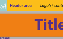
 Fig. 14: Idealized representation of the structural elements of a poster.
Source: Diagram by author.
Main area
The main area can be structured and sub-divided, e.g. by using several columns or an image across all columns, etc. In this area, you present the poster's main statement.
Footer area
Header and footer can be seen as a kind of framework tying it all together. However, the footer is not just a graphic element; this is where you can indicate references and contact details as well. This is also the only area where the font size doesn't necessarily have to be read from a distance of 1 - 1.5 m.
Background
Often there are posters highlighted not only with colors but also with a structure or an image. This background should be appropriate as regards the poster's topic and not be distracting at all. If in doubt, it is always best to choose an unstructured background color.
Fonts
In a poster you can use serif as well as sans serif fonts. For longer texts sans serif fonts should be avoided, but since you should not use longer text blocks in a poster both types can be used. Avoid decorative fonts since they are not so legible. Use boldface for emphasis, avoid underscores or italics for a poster.
If you use justification for text blocks, make sure that hyphenation is on. In order to avoid too large spaces between words better use ragged alignment. Lines typically do not contain more than 70-90 characters. Texts with longer lines should have bigger line spacing to render them more legible. Typical line spaces are 20-30% bigger than the font (i.e. for a 40 pt font you should use 48-52 pt line spacing).
Different types of posters
There are various possibilities to present content by means of a poster. The type to choose depends on the resources available.
Roll-up poster
The most common poster type is the roll-up poster; it is most
of the
time printed in A0 format and can be transported rolled-up (in
a
protective cover). This is the easiest and most appealing way,
provided
that there is an appropriate plotter.
However, there is not always such a plotter. In addition, print-outs
in A0
format can be quite expensive. A few software applications
therefore offer the
possibility to create an A0 poster before printing it in 16
pages (A4 format).
These pages then have to be glued or taped together. Compared
to a poster
in A0 format this is hardly appealing from up close but from
afar the difference
will be hardly noticeable.
Modular posters
A modular poster consists of different single pages in A4 or A3 format, arranged on a pin board. Its advantages: such a poster can be easily created as well as transported. Additionally, this type of poster requires well-structured text or image blocks. However, such posters give the impression of not being very professional and are therefore no longer very common.
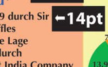
 Fig. 15: Font sizes for a digital poster created in A4 format. Source: Norman
Backhaus.
Look at the example poster with the font sizes on a screen from 1 m distance. Is it still legible?
Digital posters
Special types of posters are digital ones; they are not printed but projected. One will therefore not need an appropriate plotter; however, there are still some things to consider. Not all projectors are suited to present colors adequately. It is therefore necessary to increase contrasts as well as font sizes, due to a projectors' low resolution. When using images, a digital poster can get very large which will complicate transferring it to another computer. In order to minimize compatibility problems, it is best to create a PDF file with implemented fonts.
In order to present colors as best as possible, one should use the (additive) RGB color space (red - green - blue) for projected posters instead of the (subtractive) CMYK color space (cyan – magenta – yellow - key (= black)), which is generally used for print-outs.
Digital posters require a larger font size.
