PROJECT
“Disaster displacement ranks among the biggest humanitarian challenges of the 21st century.”
This quote from Kälin (2017) transmits the urgency of our topic presented in this project of the Spring Semester Masters Course 2022, Geo454 Geovisualization.
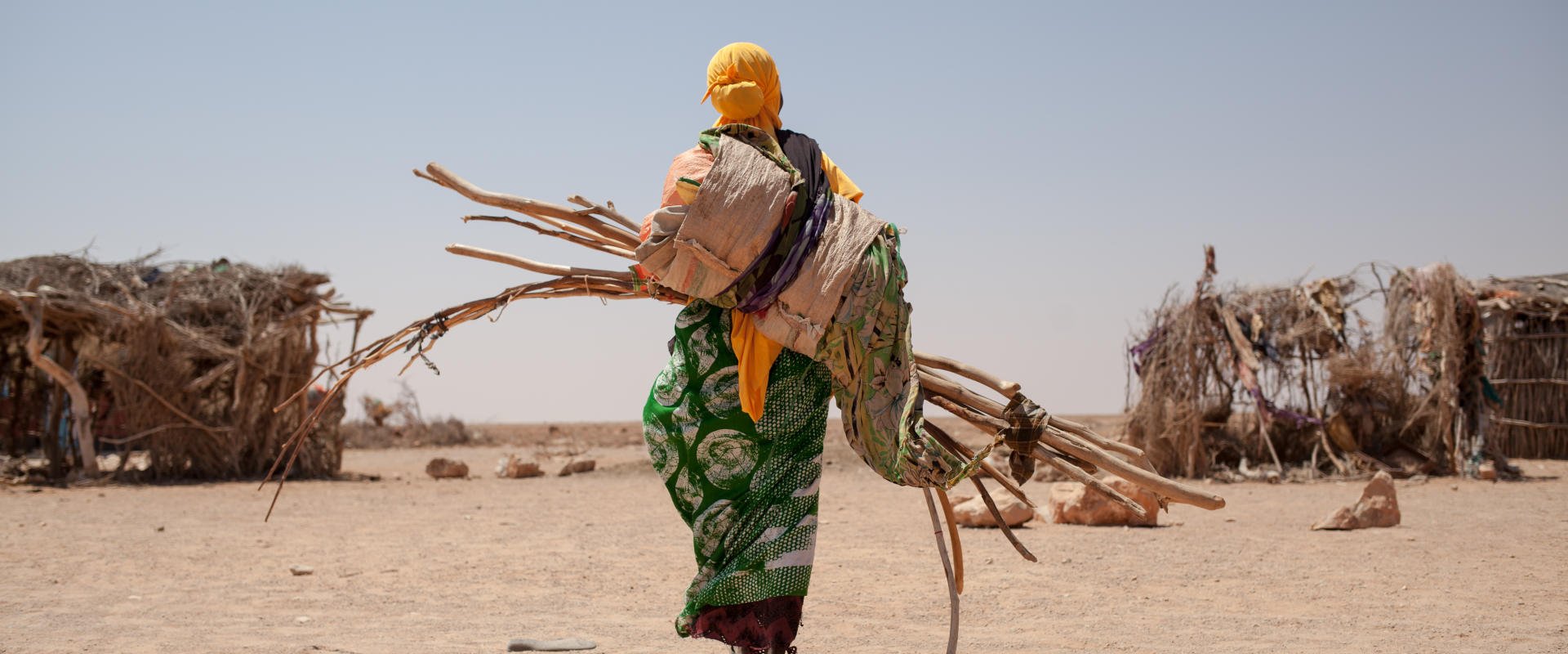
Displacement through natural disaster takes place when people are forced to move from their homes due to the occurrence of environmental hazards that threaten their well-being and livelihood. Disaster displacement often happens in regions with general low- and middle income, inequality and non-sustainable development practices. As a result of these factors the more frequently occurring extreme weather events induce further social and economic deprivation (iDMC, 2021).
There is a distinction between displacement through natural hazards and climate refugees, that has to be made. A climate refugee describes a person that crosses international borders to flee from possible harm though the consequences of global warming. Whereas displacement describes the dis- and relocation inside the same country. In practice the terms are very connected since climate change can affect people regardless their territorial location and internal displacement happens often as a preliminary stage before a level of displacement across borders happens (UNHCR, 2022).
This project only discusses internal displacement.
The thematic of displacement through natural hazard occurrences concerns not only one SDG but, but in fact several of them, such as “Good-health and well-being (Nr. 3)”, “Climate action (Nr. 13)”, “No Poverty (Nr. 1)” and “Clean water and Sanitation (Nr. 6)”.
The 17 Sustainable Development Goals (SDG) are the centrepiece of The 2030 Agenda for Sustainable Development, that is supported by all United Nation Member States since 2015. The SDGs aim for united action and strategies to end poverty and hunger, as well as (gender) inequalities and environmental issues among many other objectives (United Nations, 2015).
To reduce complexity for this project our focus lies on the SGD 13 and 3. For further information on the two goals that are emphasised with this project, click on the icon of SGD3 and SDG13.
This project addresses everyone that has an interest in gaining information on the thematic of natural hazard displacement and to get a spatial overview.
This website is structured in the tab "MAP", where an interactive map invites to visually explore the topic and research question. In the “RESULT” tab you find our findings.
In the tab "SOURCES" you find the data, literature, further readings and software used for this project. In the tab "TEAM" there is a short overview of the group which was working on this topic and where you have opportunity to get in contact with the team for further questions, suggestions or insights.
Research Question
With this project we want to emphasis the importance of the grave impact that natural hazards have on people by forcing displacement and show how this thematic finds itself at the intersection of several SDGs.
As a research question we formulate this as: How can displacement of natural hazards be assessed on a global scale and what patters can be recognized in terms of hazard types and subtypes?
MAP
Map description
The map gives an overview on how many people where displaced due to natural hazards in the time from 2016-2020. Each country provides the information of people displaced normalized to 100’000 habitants. Lighter colours means less displaced people.
The number inside the circle shows the amount of natural disaster events that happened in the aggregated area.
The colour of the circle shows to what kind of category the disasters belongs.
Map guide
- Click on the top left corner on the select symbol.
- Zoom to the country of interest and click on it. With the different selection mode, multiple countries can be chosen at once.
- The pie-chart on the right now displays only disasters from the selected country.
- Click on any (or multiple) categories to filter the list further.
- Click on the tab “Hazard Subtype” to show more detailed information about the selected hazards.
- Click on any event in the list to automatically zoom to the event.
In the interactive graphic display above you can have a look at the absolute displaced People per country or for the all countries summarized. In the upper left corner you can choose a country of interest.
RESULTS
When looking at the map on a global scale we can see that as very prominent hazards, floods and storms, are responsible for the displacement of people over the time period of 2016 to 2020.
Especially in Southern America, parts of South East Asia, Africa and big parts of Europe seem to be vulnerable to floods, whereas North America, Australia and Eastern Asia show Storms and Wildfire as a cause for displaced people.
When comparing this visual assessment of the map with the numbers we can see that the number of people that got displaced by storm events is actually larger than the ones of floods.
This same phenomenon happens as well as when we zoom further in and look at separate continents or regions. This tells us that events that happen more often are not the ones responsible for the most displaced people.
This question would need further in-depth analysis of single events.
This map also poses the nice possibility to get a global overview of what kind of hazards accurately appear around the world, such as avalanches in the middle east or floods in dry areas which might not be intuitively known.
When drawing results from this graphic display of the data several things have to be kept in mind. First that several events are here displayed as separate disasters,
but the causality between the events is not included and in reality it can be difficult to distinguish if displacement happened, as an example through an earthquake or
the following flood waves or avalanches. Second the map does not include different stages of displacement, displacement distance or possible returns.
Third that the assessment of this kind of big, layered and also delicate data with a lot of information has to be done carefully.
Through the interactivity, the possibility to explore this complex and layered data is open to anyone who want to gain more knowledge and an overview over displacement through natural hazards.
The chart beneath the map works complementary to it to also get a look at the number of displaced people per country displayed per year side by side.
The research question cannot be answered with a single statement, but rather that the result is that to asses this kind of data the understanding of global phenomenons are important,
but that every single case of displacement after a disaster is unique and the people affected by it should be the focus.
To reduce these events of happening more regularly, actions need to be made according to the SDGs.
Efforts to reduce natural disasters need to be snapped in placed in forms of policies and incentives that
contribute to add safety to critical regions and also enhance the possibility to move out of said regions into safer zones.
Additionally better safety nets need to be in place to act in the event of a disaster, that people who are forced to move from their home can to this with help and support.
And finally there is a need for better post-disaster recover strategies. Displaced have to be offered financial, working power and other support to rebuild infrastructure and their homes. Summarizing it can be stated that with
this tool of a map one can gain a good and desired overview of the global disaster displacement situation in terms of spatial aspects as well as disaster types and subtypes and displacement numbers over the years 2016-2020.
The way the data was handled, there is only little effort required to add the yearly data to the map to always have the newest numbers.
Working process
In the map, we chose to limit the visualisation to the different hazard types, since this meets our goal to generate an overview over the theme. With the help of the different pie-charts, that can be filtered, as well as with the list, more detailed information can be accessed.
Also, the base map shows the displaced people per 100’000 habitants for each country to give a quick visual overview. We chose not to show any pop-ups in the map itself to limit the amount of information shown on the screen.
The colour scheme is adapted to the whole website and guides the visitor through the experience.
For the map projection we chose the Mercator-Projection, since this project has not a specific emphasis on area or distance and the chosen projection is well known and understandable by a big range of people.
By adding the statistical graph created with Fourish, the possibility to explore the absolute numbers of displacement allows the user to get more insight into the numbers detached from the map and the visualization of the separate events summarized for every year.
A further step to elaborate this project would be to add a visualization of changes over the years as well as the seasonal changes to possibly observe temporal phenomenon.
SOURCES
Literature
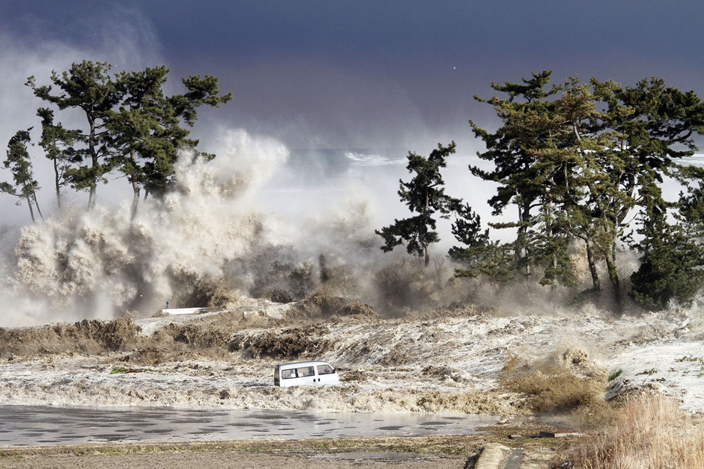 Fig.1 - Tsunami wave at the coast of Japan
DATA
We want to thank the IDMC for the kind help and providing us with pre-processed and georeferenced data of displaced people from 2016-2020.
World population data: WorldBank Accessed: 03.05.2022.
Shapefile Country boundaries: OpenDataSoft Accessed: 05.05.2022.
Basemap by ESRI Livig Atlas: Light Grey Canvas Accessed: 11.05.2022.
IMAGES
SOFTWARE
ArcGIS Desktop - ESRI, Version 10.6.1
ArcGIS Online/Dashboard - ESRI, Version 2.8
Excel - Microsoft 356
Exploratory - Version 6.9.6
Flourish - Canva Product