Tools
Colors
Choosing the right color for a poster is more important than choosing one for a presentation. It is therefore necessary to consider (if there isn't a mandatory template) which colors are best to use for one's poster. There are topics having an affinity to certain colors. Green is the color of choice when dealing with environmental topics. However, it is not mandatory to observe such rules; one can deliberately choose another color.
In order to increase legibility, good contrasts are of importance. There are a lot of theories as regards the relation of colors, and all of them are fully justified. In 1961, Johannes Itten developed a color circle, now very common and easy to apply. It is based on the primary colors yellow, red, and blue; a first mixture results in the secondary colors green, orange, and purple. If these colors are again mixed with a primary color one will get tertiary colors. The resulting color circle (available in a CMYK version as well as a RGB one) provides a good basis for your color selection. Complementary colors are rich in contrast; they are diagonally arranged (directly or in an acute angle) on the color circle (e.g. yellow and purple tones, or orange and blue ones).
 Fig. 16: Color circle according to Johannes Itten. Source: Wikibooks (http://de.wikibooks.org/wiki/Datei:Farbkreis_Itten_1961.svg, accessed: 03/03/2016).
Colors should be appropriate or form a reasonable contrast to the topic.
Good contrasts improve a poster's legibility.
Look at the color circle according to Johannes Itten (Fig. 16). What is its principle?
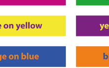
The following combinations (font on background and vice versa) are clearly legible:
- green on purple
- purple on yellow
- orange on blue
- white on black
The following combinations are less recommendable:
- blue-green on red is hardly recognizable when being color-blind (google «Ishihara test» in order to find out whether you are color blind)
- red on blue is piercing and causes afterimages
- blue on green is not contrasting enough
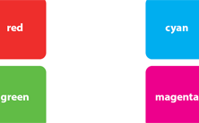
Look at the color combinations (fig. 17) and decide for yourself which ones are well readable and which not.
Software
A poster's quality does not depend necessarily on the software used but on its content and structure. However, an adequate program (e.g. an app) can make one's task easier. It is possible to create posters by means of word processing programs (e.g. Microsoft Word, Open Office, Apple Pages, LaTex, etc.), presentation software (e.g. Microsoft PowerPoint, Apple Keynote, Open Office, etc.), or layout software (e.g. Adobe Illustrator, Photoshop, InDesign, etc.). Layout software offers more options and better quality but is not always accessible. It is nevertheless possible to create an appealing poster by using word processing programs or presentation software instead.
Using good software can enhance your poster.
Images and graphs
It is important to pay great attention to an image's quality. When creating a poster in A0 format, images must have a good resolution. You therefore have to consider redrawing simple graphs or maps to avoid using a pixelated image from the Internet, which would not be very professional and disturbing to the eye. With graphs eliminate chart junk to focus on data and label graphs directly instead of using legends.
Before printing a poster, you should check it thoroughly since any corrections afterwards can be quite expensive. It is easy to detect and correct any (typing) errors on screen; the colors used can then be tested by using a color printer and a print-out in A4 format. For digitally presented posters the RGB color space should be used, for print CMYK.
Using a bad resolution of graphs and images is rather unprofessional.

