Results
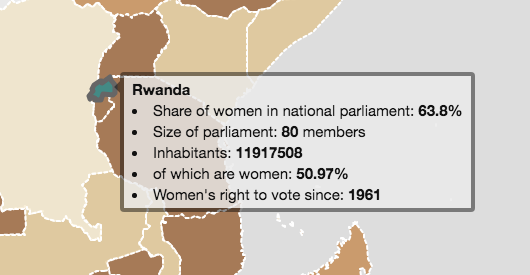
The map on women in parliament shows that in 2016 only in two countries (Rwanda and Bolivia) women represent more than 50% of the national parliament. Thereby it is to mention that we only looked at the lower or single houses and neglected the upper house or senate as a lot of countries only have a lower or single house. The story of Rwanda’s majority-female parliament has a rather sad background, as its change in national and local politics goes back on the genocide in 1994, after which about 70% of the remained population was female (The Guardian 2014).
The map also shows that in 2016 in quite a lot of countries the share of women in national parliament was below 40%. It also seems that there are no big differences between countries of the Global North and countries of the Global South in general. This means you can find countries of the Global North with very low percentages of women in national parliament and on the other hand for example the countries with the highest percentage of women in national parliament are countries of the Global South. Due to the IPU data, Switzerland for example was in 2016 only ranked number 36 with 32% women in national parliament (Nationalrat). But it is also to mention that we had only data on national parliaments, on a local scale the situation might be different. And we also do not know how many women run for political positions.
For the map on women in managerial positions we had data for fewer countries than we had on the political positions. Most of the available data is for countries of the Global North. The map shows that there is no country with a higher share of women than men in managerial positions. The map shows also some geographical patterns. It can be observed, that in the Middle East almost no women are in managerial position, whereas in Europe most countries have at least a share of 20-30% of women in managerial positions. If we compare the map with the one on political positions, we can see that in some countries, as for example in the USA, Australia and France, the share of women in managerial position is higher than the share of women in national parliament. And also the first scatterplot where we compared women in managerial and political positions shows that a high share of women in political positions doesn’t necessarily mean that there is also a high share of women in managerial positions. But in the case of the Middle Eastern countries there can be observed, that these countries show a low share of women in managerial as well as in political positions. This can probably be explained by the patriarchal system of most of those countries.
Regarding the percentage of people enrolled in secondary education per country, it can be said that it seems that the different continents have different shares of people enrolled in secondary education. Unsurprisingly, Europe, North America and some Asian countries have a very high education level. This is even more clear if you look at the scatterplot of secondary education and political participation where the country points are colored according to their continent. Secondary education seems to have no direct influence on participation of women in politics. The share of women in managerial positions on the other hand seems to have some correlation with secondary education even though there is not that much data available for these two data sets.