ABOUT THE PROJECT
We love Geovisualisation
According to the sustainable development agenda from 2015 the United Nations (UN) formulated 17 Sustainable Development Goals (SDGs) to “transform our world” by trying to enhance the current social and political conditions. All UN member countries adopted these guidelines and oblige themselves to end poverty, protect the planet and ensure prosperity for all by 2030. In this project we took a closer look at Goal Number 2: Zero Hunger. The fact that one in nine people in the world are undernourished leads the UN to the target to end hunger and ensure access by all people to nutrition and sufficient food within less than fifteen years. To achieve this standard, the UN strategy will not only be the increase of investments in less developed regions but rather empowering them to self-aid, namely through a double of agriculture productivity. In this context the project focuses on the latter aspect by questioning if there is the statistical possibility of a developing country to feed its population by their own crop yields. Our aim here is to use an explorative approach; we developed an interactive web-map, which shows statistical data on (mal-) nutrition and agricultural production for each country from which data was found. Furthermore we calculated a ‘Crop-production-index’ that measures the degree of self-sufficiency of each country (=yield per capita). In a next step, the indicator could be classified and applied to different scenarios, which are explained further below in the concept section. Finally, we try to explain our findings regarding possible impacts on the achievement of Goal 2 by 2030. Our assumption is that developing countries are able to feed themselves by their inland food production.Meanwhile the investigation disregards any other goal formulated by the UN during the research process. For more details, please use the buttons above to guide yourself through the content or just scroll down the page.
The UN Sustainable Development Goals
CONCEPT
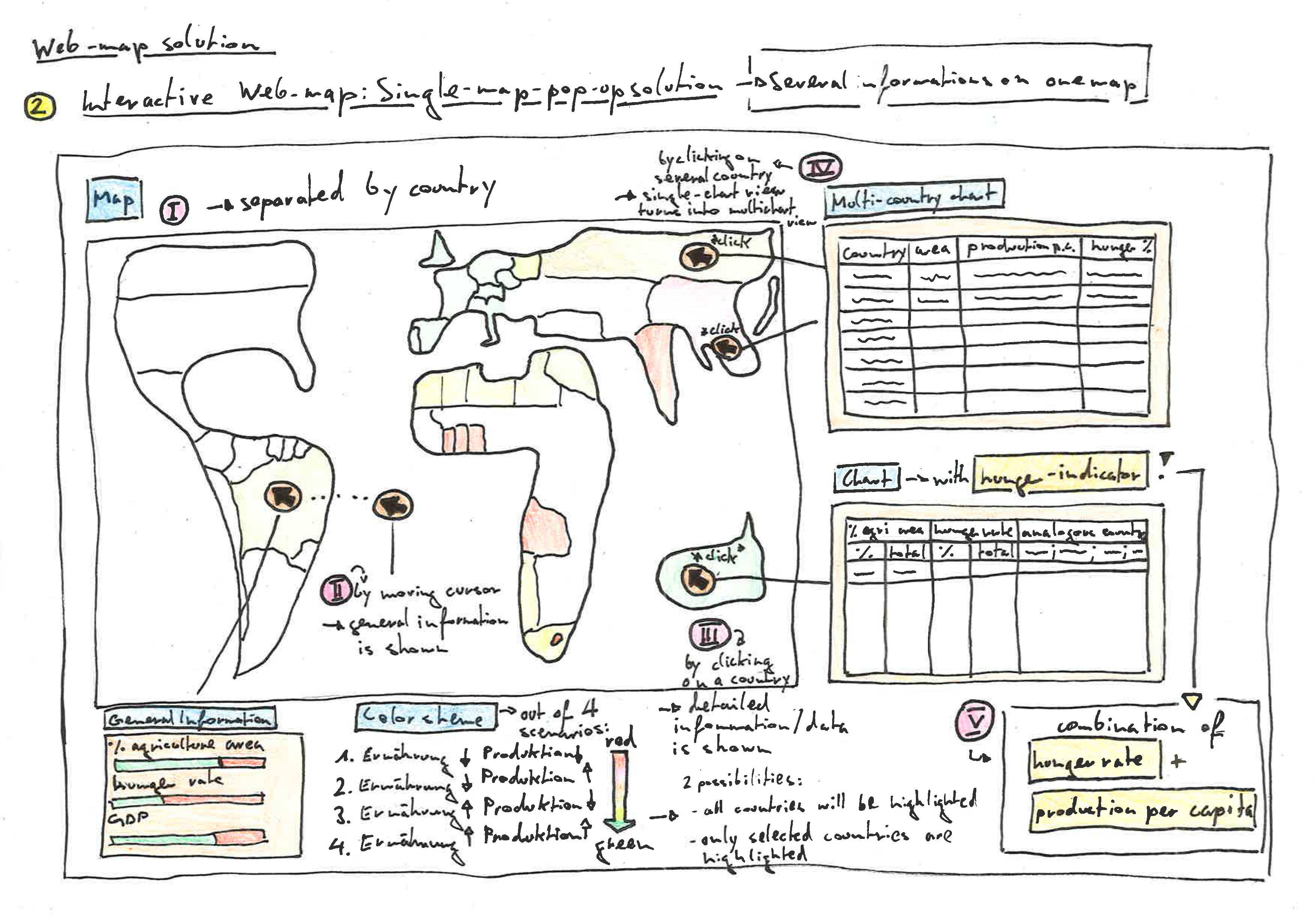
Our basic idea was to create an interactive web-map to point out the relevant numbers. All data shown should be separated by country. The most important requirement of this map would be the elaboration of a meaningful colour scheme. The first approach was to correlate undernourishment and food production data from each country and then classify the outcome into four scenarios: In the best case a country has a high food production and enough food (=no hunger); the worst case would be when there is no food as well as no possibility of sufficient food production. Another possibility would have been to implement a bivariate colour scheme that covers all scenarios and classes equally.
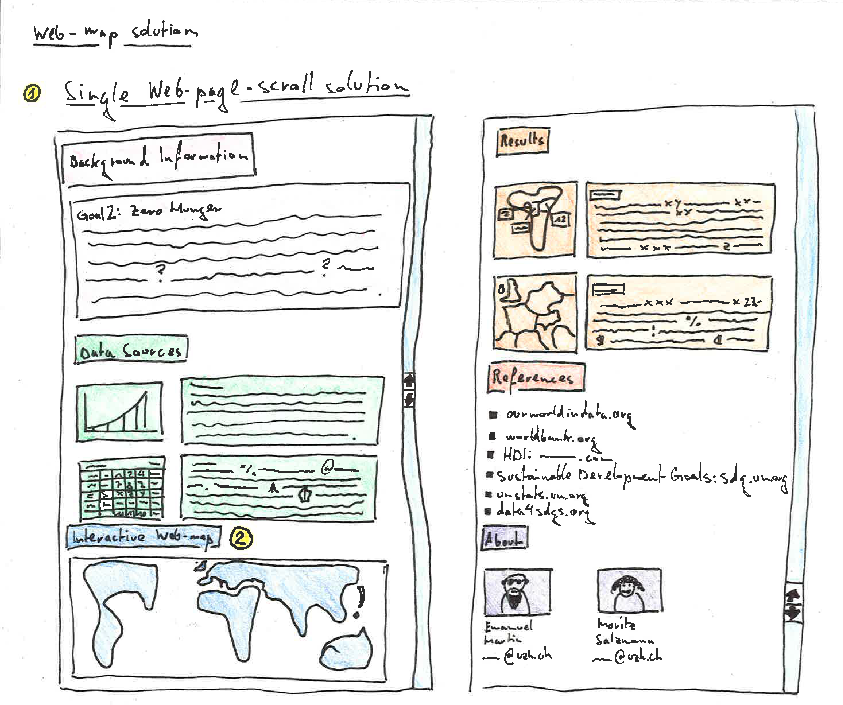
On the sketch below you can see the first concept of the web map and a brief overview of its functions: The base map provides a world view. For detailed information the mouse cursor has to be moved over a country. For even more details and the comparison of different countries, several countries must be chosen by clicking on them.
SHINY APP
This application was developed with RShiny®. Please choose a desired variable and choose a year on the left panel to highlight the map. Click on a country for specific information. The darker a country is coloured the higher its value.
Open Shiny App Standalone
DISCUSSION AND FINDINGS
The self-sufficiency of a country can be measured. Though, a wide range of different thematical data has to be considered. Furthermore correlation analyses are required to extract the relevant data and provide meaningful findings. In this project, we developed a ‘crop-production-index’ out of different agricultural yield types (e.g. tomatos) which we summed up and multiplied with ‘arable land use per capita’ to get a value for ‘yields per capita’. At the same time the project did disregarded other data topics, such as climate conditions or trade numbers as well as average calorie needs per capita, which could have an important impact on the global hunger situation.
It can be also said, that our assumption we made at first could not be confirmed. Most of our datasets do not consider developed countries. The countries observed show more or less the same picture: although the share of land area used for arable agriculture (partly more than 30 percent) of a country is high, its hunger rate has not automatically to be low (taking Zambia or Nigeria as an example). Instead it can be assumed, that high food production has no impact on the hunger rate of a country. The crop-production-index supports this finding while showing no significant patterns. For instance, Niger has the higher value of yields per capita (17 points) than Brazil (13 points), but a multiple higher value in the Hunger Index (30 to 5 points). On the other hand, countries with low food production values also have a high rate of malnutrition.
After all, we cannot make any statement in terms of a possible impact on the achievement of SDG N°2. The database we used for this investigation was not representative; also statistical tests would be required to gain a complete image of the situation.
A LISTING OF ALL DATA SOURCES AND REFERENCES
To calculate such a hunger- or undersupplies-indicator (call it whatever you like) we had to collect different geometrical and thematical data that measures undernourishment and agricultural (food) production. The data that has been used in this project all originates from ourworldindata.org and worldbank.org . All data was processed with R®. The following datasets were incorporated in this project. Click on the links to follow them.
This website was created with html, css and javascript, the map visualisations were made with Shiny®.