
Suicide has been a major cause of unnatural death over several decades. Today, 800'000 people still die every year due to suicide 1. As a result the United Nations set the ambitious goal to reduce by 1/3 premature mortality from noncommunicable diseases through prevention and treatment and promote mental health and well-being. In order to reach this goal, the UN states six major points, how a country can prevent and control suicide2:
1. Reducing access to the means of suicide (e.g. pesticides, firearms, certain medications).
2. Reporting by media in a responsible way.
3. Introducing alcohol policies to reduce the harmful use of alcohol
4. Early identification, treatment and care of people with mental and substance use disorders, chronic pain and acute emotional distress.
5. Training of non-specialized health workers in the assessment and management of suicidal behaviour
6. Follow-up care for people who attempted suicide and provision of community support.
According to the points 4, 5 and 6, the health care sector seems to play a crucial role in suicide prevention. However no research on a global scale has investigated so far, if there is a interdependency between the evolution of a country’s suicide rate and the evolution of a country’s total workforce in the mental health sector. By visualizing the data of a country's suicide rate, a country’s workforce in the mental health sector and a country’s relative investment in the health sector, no significant statements can be produced. Since the majority of the data quality is not expressive and not normal distributed. But visualizing the data allows to explore the data in a different way than than applying regular statistics on raw numbers as you will see in the following sections "Maps" and "Discussion". This reasearch is an overview on the global distribution of the suicide rate and the mental health factor and can be used to find areas of interest, where further research is interesting. As a secondary aspect the data quality classification of the WHO is visualized to give and additional information and to put the displayed values into perspective.

To open the application in a full-sized window click here

It must be emphasized again that suicide is an extremely complex issue. The literature has identified many different reasons for suicide such as economic recessions, gun prevalence, daylight or the media coverage of suicide mainly through correlations. But especially in such a complex topic as suicide, correlations do not imply causation, it is rather a valuable starting point to detect risk factors 3. Hence it is not surprising that the linear regression between the workforce in the mental health sector and the suicide rate does not show any significant results or a clear correlation (Download residual data). Especially because it is also questionable to create the variable "mental health sector" only on the amount of staff on a global scale. But the visualization allows exploring the data in a different way. For example a spatial pattern can be observed in Europe. Western EU-states have a negative residual value and former Soviet states tend to have a postivie residual value. This could mean that the mental health staff in former Soviet states have a poorer learning program for the mental health work staff than many other western EU countries. As a result researcher could try to analyze if there are strong differences between the teaching program for mental health staff in former Soviet countries and the western EU countries. In summary, it can be said the visualization does not allow to conclude significant results. It is rather a tool that invites to explore the data, recognize patterns and create specific research questions for studies on a much smaller scale which in the end might produce knowledge from which in the end the whole world could profit.

In Lab4 we start exploring the data visually, making some simple plots with R:
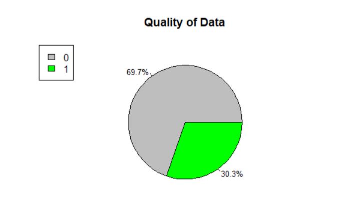
As the data is collected globally, the first check is to see how the data quality is. For this a simple pie chart has been made, showing the relation between data that is classified as good (1) and data that is classified as not reliable (0). This classification was adopted by the United Nations4. It can be seen that over two third of the data is classified as non-reliable. An important aspect that has to be kept in mind for future analysis! The data was gathered from gapminder, since it is more complete than the data from the UN 5. The only set of data which is directly from the UN is the workforce of the healthsector set6.
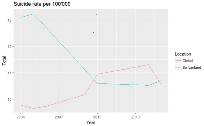
To get a first overview on the suicide rates a plot was made showing the rates for Switzerland and the mean global value. The numbers are comparable as they both are normalized per 100'000 people. It can be seen that Switzerland had a higher value than the global mean. This can have many different reasons, one of it being the higher information system im Switzerland.
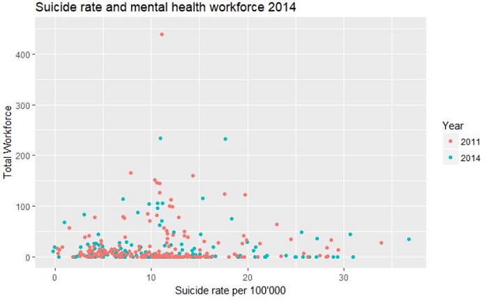
To see how the development is for both the suicide rates and the total workforce in mental health the data was plotted for both census years 2011 and 2014 and visualised in a scatterplot. For this plot the dataset containing data for all the countries has been used. It can be seen that generally the number of workers in the mental health sector is rather small. Just from this plot there is no correlation or relation that can be detected.
In this following section the decisions and considerations for our shiny application are described and explained. To visualise the normalized data provided by the WHO on suicide and mental health workers we decided to create a choropleth map. The data is visualized per country, which provides a quick global overview. To visualize the data the visual variable colour lightness is used, for the suicide data different red and for the mental health data different green shades 7. For the comparative visualisation (regression) a divergent colour scale has been chosen as the values go from positive to negative.
To be sure that the user understands how the application works an infobutton was created, when clicking on it a text window pops up explainng the main features of the map. As the map inititation takes a while a spinner was added, this indicates a loading in progress message for the user.
General page layoutWhen the application is opened on the top there are three different tabs, each topic that is visualized has its own tab to prevent confusion. On the left there is a column with the possible inputs that can be given and the plot that is rendered depending on what country is clicked. On the right the main element is the map with the data visualization. The application is embedded in the website, this has the advantage that the map has loaded when the reader reaches the map section. The option to view the application full-screen is also provided in clicking on a text that opens the application separately.
Visualise normalised data on mapThe first selection that can be made in the left column alters the colours and thus data displayed in the map on the right. This is either done via slider input (for the year selection of the suicide data), with a dropdown selection (for the professions of the mental health workforce data) or a radio button (year selection on the residual map). To get some more precise information on the values shown by the colours when clicking on a country a pop up appears with the exact value for that country.
PlotsRight below in the column on the left there is a plot displayed. When the map is initialized it shows some global mean or median values, as soon as one country is clicked on the data that can be selected for the inputs is displayed in the plot. As it can be seen, for the suicide data some values were interpolated.
Background mapWe wanted to use a background map with features to facilitate orientation for the user. This is done in using the Openstreetmap map as a default background when the application is opened, as it is a very common background (oceans are coloured blue, names of countries are visible, borders etc. are displayed). As the background map is coloured and can be distracting when focusing on the colours that visualize the data we added the option to change the background to black and white as it will enhance the coloured polygons representing the values in the countries.
Highlight the data qualityAs an additional option on the map the data quality can be selected. This will highlight the borders of the countries belonging to the selected data quality. This option can be found on the map, just below the option to select the basemap. It is placed there, as it is a command altering the map immediately but not having anything to do with the different categories of themes. The data quality remains the same for a country for all the maps.
Map ProjectionThe project should give a global overview on suicide and mental health, this is done using a map in the Mercator projection. Some reasons why we decided to choose this projection are that people are usually familiar with this projection. This should call for an easy orientation on the map. Additionally, there were some technical reasons, in order to facilitate the orientation for the user we decided to use a leaflet map as a basemap and add the country polygons with information on top of it. This should further facilitate orientation as names of either countries or other locations in space pop up depending on zoom level. The problem is that the leaflet map in the background is provided in the Mercator projection. In this projection the landmasses in the upper latitudes are exaggerated and the ones in lower latitudes are understated 7. This is especially problematic, as we show the data quality as an additional possible information. As the data quality is tendentially lower in countries of the global south the impression can be given that there are more countries with a high data quality than a low due to the size of these countries in the global north. For the overview the projection is acceptable, for the additional information on data quality it is not optimal. As it can be seen in the lab 4 section only 1/3 of the countries are classified as having high quality data, when selecting the high-quality option on the map it seems like a bigger part of the world has high data quality.
Things to improveA flaw in the legend is that the breaks between the values are not correct, one value can be part of two different categories. This is an implementation problem, the legend visible now is made by default.
The classification method chosen is not very good. Now the data has been classified in the following: The category with the highest data spread has been selected and for that selection natural breaks were used with the Jenks natural breaks function in R. For readability we want to have the same legend independent from the input. This means that the natural breaks of one category are used as classifiers for all the others, which is certainly not ideal. A deeper data analysis is needed to find the best data classification method.
A technical problem is also that in the suicide plot the colors are not fixed. Meaning that the global data has a different colour depending on the first letter of the country that is selected. This can potentially be confusing.

Questions regarding the content of this website can be sent to the authors of this website.
Authors: Federica Corti, Jan Guddal
eMail: federica.corti@uzh.ch, jan.guddal@uzh.ch: