Welcome!
This website is the main element of the student work in the module GEO 878: Geovisualisation. The aim of this website is to document and present our project.
The aim of this project is to design and implement an interactive web map solution. The thematic focus lies on one of the United Nations (UN) sustainability goals (see UN SDGs Website). The whole project is therefore built around the 11th Goal: Sustainable Cities and Communities. Read more on the background of this project in the project section bellow and get some insights into the different steps involved as well as early prototypes in the lab section. The last part, simply called information, gives a comprehensive overview of the geometric and thematic data, literature and inspiriational websites/ressources used.
Project
The 21st century comes with a lot of challenges. Therefore the UN announced 2015 the 17 sutainability goals to end poverty, protect the planet and to ensure prosperity for all. For this website the goal 11 was the main motivation to create our web application. Make cities inclusive, safe, resilient and sustainable is therefore the overall target.
Thematic Introduction to Project
Cities nowadays provide a unique social and economical landscape. Main services of cities are the creation of jobs, basic services for a dense living population including affordable housing, transporation and transport safety, recreation areas, sanitation, water and food supply, science, culture and education and innovation. In this century the amount of people in cities will increase to around 70–80% (Bannister 2007). This means that the cities infrastructures are challenged by the growth of the population.One problem among others is the increasing need for flexible mobility. People need a cheap way to move around in a city. Good city planning can improve to build up or establish sustainable short circuit economies where distances of travel by the habitants are minimized. Bicycle sharing offers can dramatically improve the transportation within such socioeconomical spaces (Collier et al. 2013). This way the goal of strengthening environmental, social and cultural amenities can be reached. Ahern et al. also describes how bicycle routes are well combinable with strategies to improve the resilience and sustainability of cities. They are a good example for the implementation of multifunctionality in cities where greenways can be included and therefore improve habitat restoration leading to benefit for urban biodiversity (Ahern 2013). An answer to many calls for environmental friendly transportation systems strengthened by the global debate about climated change could also be mitigated by using sharing bicycle economies (Ahern 2013, Kenworthy 2006).
Zahran (2008) shows that income has an influence on the use of bicycle in the US and Sietchiping et al. (2012) describes how motocycles and bicycles are the main mode of transportation in rapid growing sub-saharian cities. The main winner there is probably the motocycle where the world bank review describes that cheap and functional transportation is demanded by the people. This leads to the use of motocycles because they need much less space in the bustling and dense urban places then bicycles. Although bicycle also tackle this space problem they are less used because of the lower power as a transportation vehicle (World Bank 2002). But Zahran et al. (2008) also describes that in the US the use of bicycle decreases with the increase of hazardous air pollutants (Zahran 2008). This raises the question if in other countries like the ones described by Sietchiping et al. people also consider such things or if more people are at risk to be affected by harmful pollutants. Another harmful factor which is present in the US aswell as the subsaharian countries is the risk of being involved in an accident. Compared to european countries the risk of being killed or injured as a cyclist or pedestrian is high. Therefore another need for encouraging people to use bicycle as a form of transportation is public safety. Compared to other countries some european countries have changed from road planning to safe pedestrian and bicycle planning. The third important variable besides the ecological and social benefits, which underlines the importance of bikes as a partial mode of transportation systems is the simple health benefit of cycling. As the paper of Pucher et al. (2003) states: "Several articles and editorials in the leading medical and public health journals have explicitly advocated more walking and cycling for daily travel as the most affordable, feasible, and dependable way for people to get the additional exercise they need" (Pucher et al. 2003). Overall we see that a lot of factors influencing the use of bicycles as a part of public transportation and that these factors are highly dependant on the local properties. But with respect to the SDG's a lot of problems in any big city of the world could be mitigated by sharing bicycle systems.
The importance of sustainable, eco friendly and cheap or lets say fair transportation is undoubtedly important aswell as the benefitial effects on each habitants living quality for example by increasing personal health. Questions therefore remain on how exactly sucessfull bicycle sharing projects can be implemented. Findings in the literature show that short circuit economies, pollution, the physical and social environment, socioeconomical factors and some cultural, historic background can explain the amount of bicycle-users in urban places. Therefore we visualize one case where such a transportation system is widely used (New York City) and how it can substantially contribute to a sustainable city. The visualization therefore can help to optimize such systems and furthermore help to estimate what the potential or problems of bike sharing can be for other cities around the globe. It investigates patterns of users and combines it with the spatial relation of the city. Although bicycle transportation of course cannot replace all kind of transportation systems and we have to be aware of the specific social, economical and cultural background of a city it can mitigate to the challenges of the 21st century.
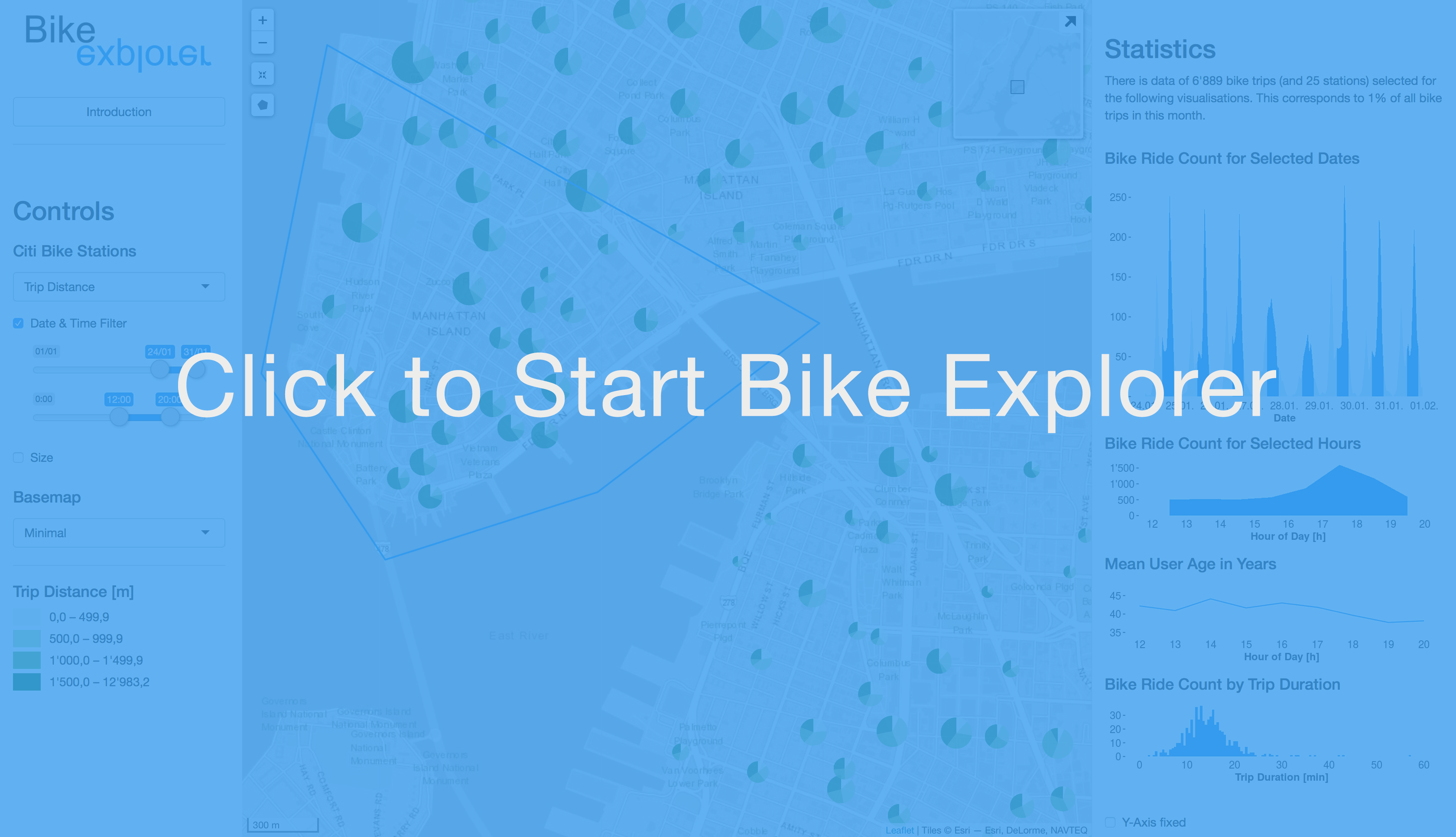
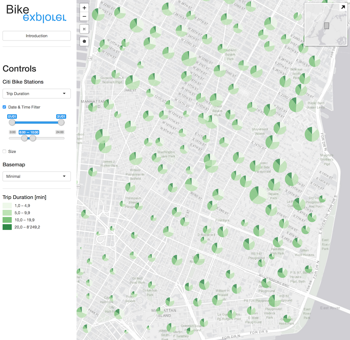
Web Application: Bike Explorer
Possible research questions
As the design solution is fully interactive, there is a multitude of questions that can possibly be answered by exploring the data in our web map. We narrowed them down to three questions, of which we think that they are interesting to look at.
Weekday
Following our 11th UN goal 'Sustainable Cities and Communities' a main focus lies on the question of how such a bike sharing is used. Do people use these bikes for their daily commute or just in their freetime? If so, to what extent do they cover their commute by bike?
Possible Answer
One could first just have a look at the overall map and get some statistics for all the stations in New York City. Therefore we just draw a polygon around all stations and have a look at the statistics and visualisations:
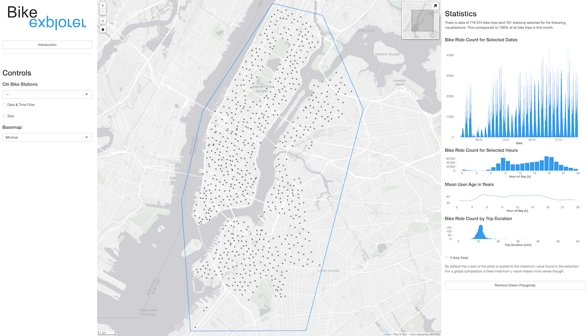
There is a number of things one could now look at. One interesting information is for example the second visualisation named 'Bike Ride Count for Selected Hours'. There are two relatively clear peaks, one in the morning and another one in the late afternoon. A similar pattern can be seen over the whole time period, although there seem to be clear differences inbetween days.
From there another approach could be to look at different days of the week. To do this, we decided to select the area around central park and look how the bike usage differs inbetween the workweek and the weekends. The result is quite clear: during the week there are those bimodal distributions (morning and afternoon commute) whereas on the weekend there is just one peak (in the afternoon).
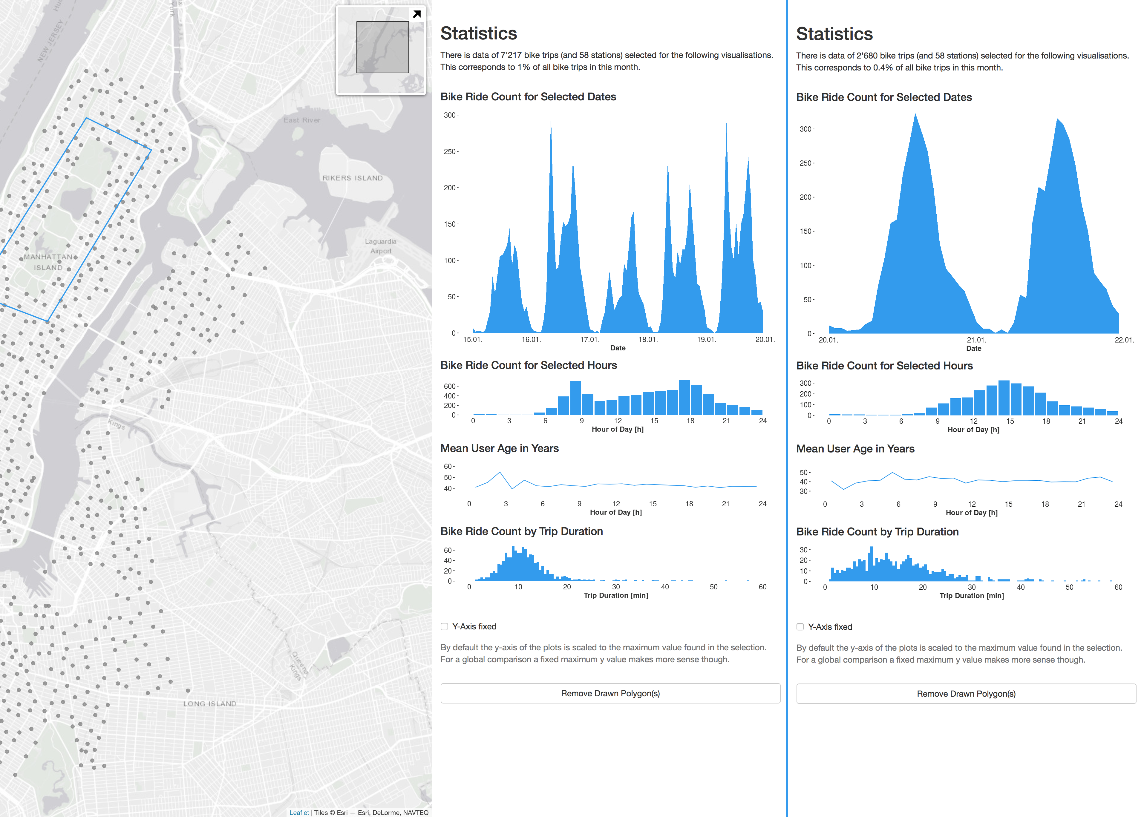
But there is even more one can see in these visualisations. Have a look at the trip durations in the lowest visualisation. Trip durations tend to be much longer on weekends. Or why is there only a limited number of rides on the 15. januar (monday) and no clear bimodal distribution (hint)?There is a lot of material for very interesting discussions and patterns one can find. Explore it for yourself!
Commute
Similar to the 'Weekday' topic where some clear commuter patterns were found we here try to further make an argument for bikes as a valuable extension of public transport systems. Why not have a look at the main transportation hubs in the city?
Possible Answer
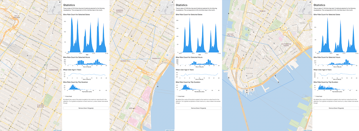
As expected there is a very clear commuter pattern visible in the data. Interestingly at Penn Station (left) the commuters arrive earlier than for example at Grand Central Terminal (middle). A reason for this might be the relatively short commute from New Jersey compared with the up to an hour train ride from Long Island which arrives at the grand central terminal. The last commuter hotspot, the Downtown Ferry Terminals show yet another temporal pattern: there is way more bike rides in the later afternoon. One reason could be that this is biased by tourist that lend bikes here for longer rides (see trip duration visualisation) along the riverfront.
It seems like there is a large proportion of people using these citi bikes for the last mile of their daily commute. Another indication for this is the following visualisation, featuring the built in pie chart functionality:
User Age
Are there spatial patterns visible when looking at different age groups?
Possible Answer
One very obvious observation is that there is quite a drop in mean age over the night. This totaly makes sense as younger people tend to go out and stay out later in the evening. A difference in user age can also be seen in a spatial way, for example in a comparison of Queens and the Upper Westside (Uptown). People using the bikes in Queen are in general 10 years younger than Uptown users. Just draw a polygon around Queens, have a look a the statistics and do the same for the Upper Westside.
Lab
Updates on the current labs including interim results if available.
Browse through the more or less chronologicaly ordered content or jump directly to a specific section: Project Proposal, Data Exploration, Main Challenges, Design Considerations or our Wrap Up,
Step 1: Setting up the website
In a first step we set up this website. With just a handfull of given requirements (i.e. included sections like background information) we added some of our own: responsive webdesign (good user experience on small as well as large screens), high level of accessiblity (the reason why we choose a one page layout with a very basic structure to make it easier to navigate the website for visually-impaired people) as well as a clean, functional design.
Web Technology
Besides html and css a few javascripts were used to provide the functionality we wanted:
- smooth scrolling: click on one of the menu items, "Intro" for example, and see how it smootly scrolls up to this section.
- header, sticky: while scrolling down the header will stick to the top, this is done with a short js script.
- footer, date: there is nothing more annoying than an out of date copyright year on websites. Therefore we use the js "getdate" functionality to update this information on the fly.
- project section, tab menu: as our website consists of just one page, we decided to reduce the space for our three possible questions that can be answered with our tool. The most simple solution we could find is the html-css-only tab menu in the project section.
- deactivate hoover for touch devices: a common problem with touch devices is, that they do not have hoover functionality, therefore we implemented an already existing script to deactivate this behaviour if a touch device is recognised.
Color Scheme Website
The whole color scheme is kept as simple as possible. As soon as our web map is designed we might make some further changes to the website. Displayed here is the color scheme we are using right now:
Hoovering over a specific color gives information on where this color is being used (limited to non-touch devices).
Step 2: Project Proposal
Having decided on a theme and its associated data (Citi Bike in NYC focussing on sustainable transportation) we brainstormed to come up with a range of possible visual elements for the interactive map:
- Pie charts for Citi Bike stations
- Weighted lines inbetween Citi Bike stations
- Heat map for bike accidents
- Statistics calculated on the fly (i.e. daily usage, user age, ...)
- Wishlist: some UI to control date & time, different context layers (ie wealth, working/living areas, etc.), animation when parameters are changed in the controls (ie pie chart with dynamic change of sectors if another category variable is choosen), …
The basic idea of our application is to provide an exploratory tool that makes it easy to detect spatial patterns with a focus on the Citi Bike stations. Important information, that should be derived from the visualisation is the number of bike trips, some trip attributes (ie duration or most popular stations) as well as background information on the users (ie age or gender). To give the data some more context, we plan to also include information on accidents in the form of a heat map. Further extensions could be the inclusion of layers with demographic information (ie wealth, working/living areas, etc.).
For our proposal presentation we designed the following mockups to give an impression on the planned functionality as well as the design of our final application.
To have some criteria for our final product, we came up with the following user stories (similar to requirements, but more dynamic, which goes along well with our agile programming approach):
- The user is able to interact (zoom/pan) with an interchangeable background map and its added content.
- An inset map shows the user where the shown map section is located.
- The user can (de-)activate predefined layers as well as define their content (ie what categories are shown in pie charts and which variable defines their size).
- The user is presented an interface that summarizes on-the-fly basic statistics and diagrams (ie trip durations, favourite stations, ...) of either the data shown in the specified map section or a selected station (tbd).
- Basic legends as well as further cartographic specifica (ie scale bar) support the user in reading and understanding the presented data.
Step 3: Data Exploration
In a first step we will focus on the citibike data 2018/01 and then scale it up (or maybe even down) depending on performance of our shiny application. As we plan to focus on the ~800 Stations in NYC the amount of entities is relatively limited. Our main concern is with our metadata providing information on user age, trip duration, trip distances, end stations, etc.
Our goal is to have a solid data base from which we can build a variety of interactive visualisations. To accomplish this we did a quick check on possible data types we could use and ended up with: simple features (relatively new geometry class that provide similar functionality to data frames) as well as data tables (similar to data frames, but faster).
Overview citi bike data, 1.–31. Jan 2018
- 718'990 bike trips
- 138.5 MB file size
- 766 bike stations
- 510s (median) trip duration
- 4421929s longest trip duration, which is around 51h and most likely not valid
In r some basic histograms and plots were calculated to look at possible correlations and non-spatial patterns. The scope of the analysis is very limited though and should just give a first glimpse at the data set at hands. Check them out below!
While doing some reseach on already completed projects working with the city bike datasets, we came across a pretty neat animation provided by The New Yorker, check it out on: https://www.newyorker.com/news/news-desk/interactive-a-month-of-citi-bike [24.04.18].
Bike Rides: A first visualisation
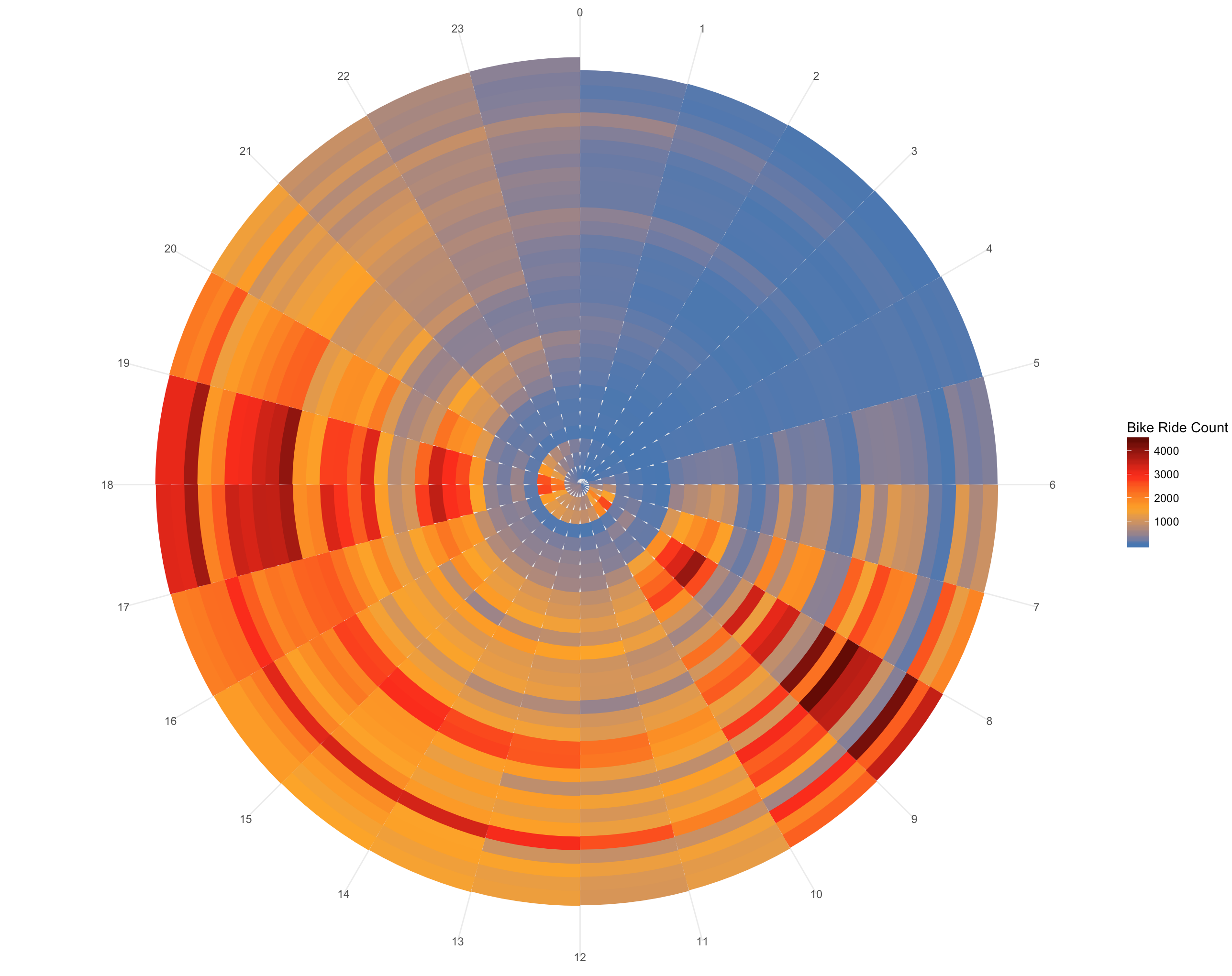
With the goal to get an overview of the over 700'000 bike rides as well as a keen interest in visualisations, we took the challenge to go further than just scatterplots or histograms. We built a network out of the available data, reduced it to journeys that were taken more than 20x in a month and tried to visualize it.
To make sense of the position that the bike stations have in the circle, we implemented a simple idea: for all the stations in Manhattan (we did the same for Queens and Brooklyn of course) we calculated the nearest distance to the polygons of Queens as well as Brooklyn. These two distances we used to form a ratio: Dist_to_Manhattan / Dist_to_Queens. This number now tells us if a stations is closer to either Brooklyn or Queens and therefore give a logical order (high numbers: closer to Brooklyn, low numbers: closer to Queens) that was then used in our visualisation. The rides inbetween the stations were then ploted and the result is pictured bellow.
Maybe not the best visualisation for our data, but we learned a lot while making it and there is still some learnings from the visualisation itself.
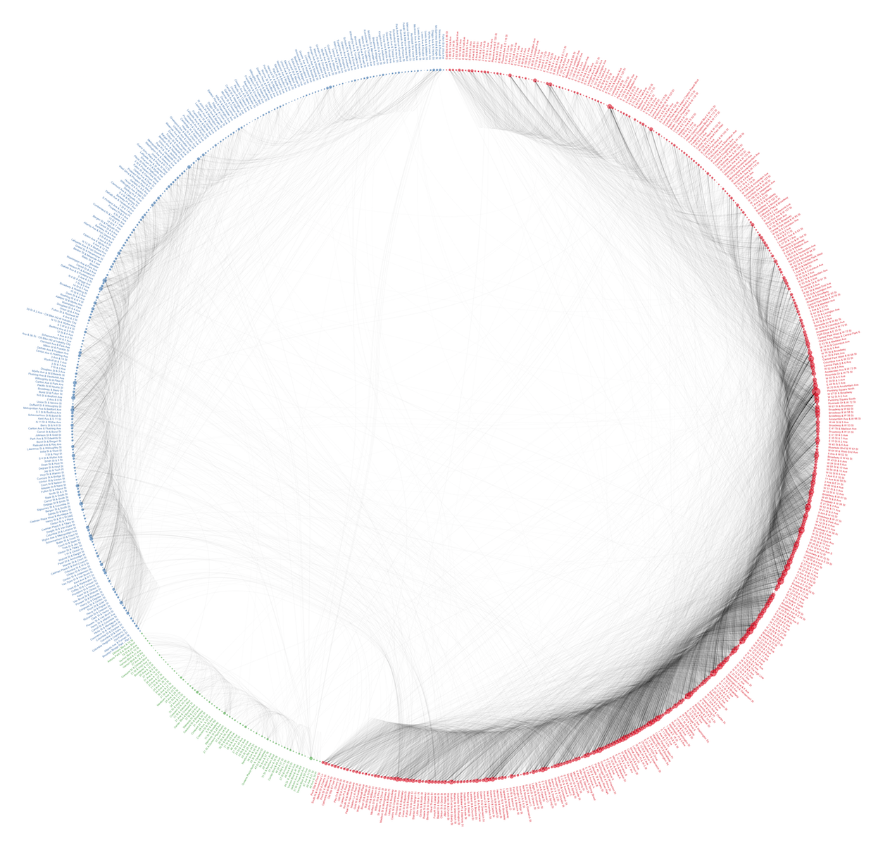
The size of the circle associated with each stations represents the number of departing bike rides.
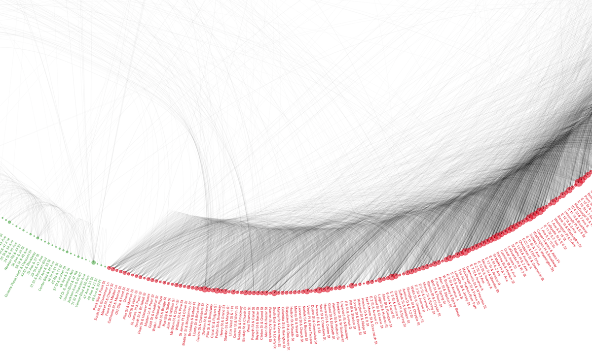
Up to now we only look at the above explained ratios to do our sorting. An improved version would also take into account the distance inbetween the different stations, but we have not yet come up with a solution that respects this.
General Data Exploration
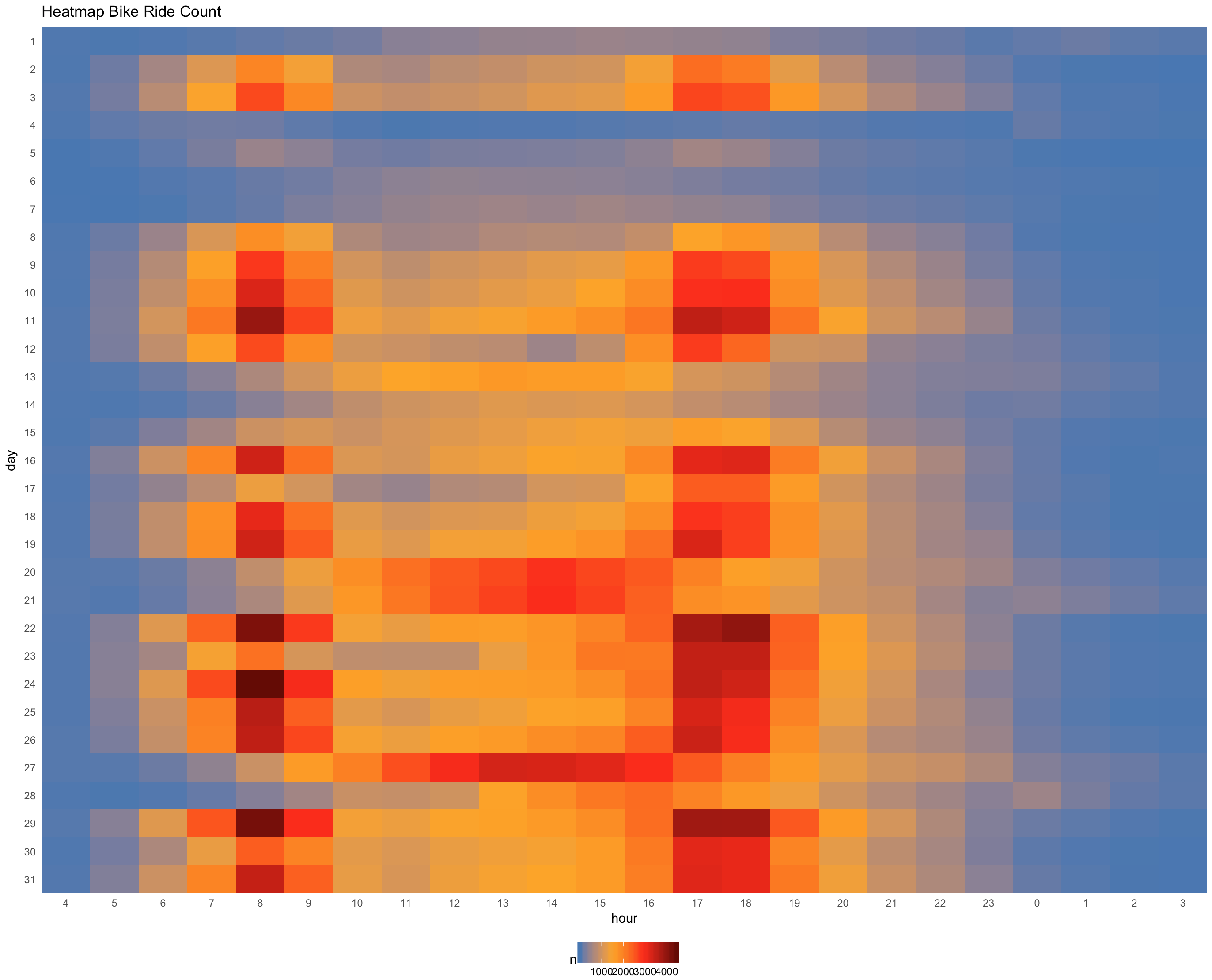
Of course we also did some other data exploration to look at it a bit closer. Bellow you find several quite interesting visualisations that we created along the way:
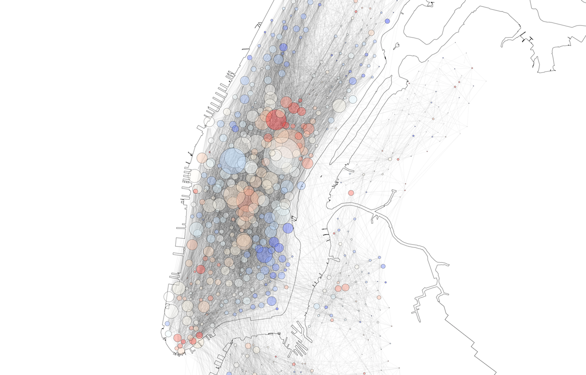
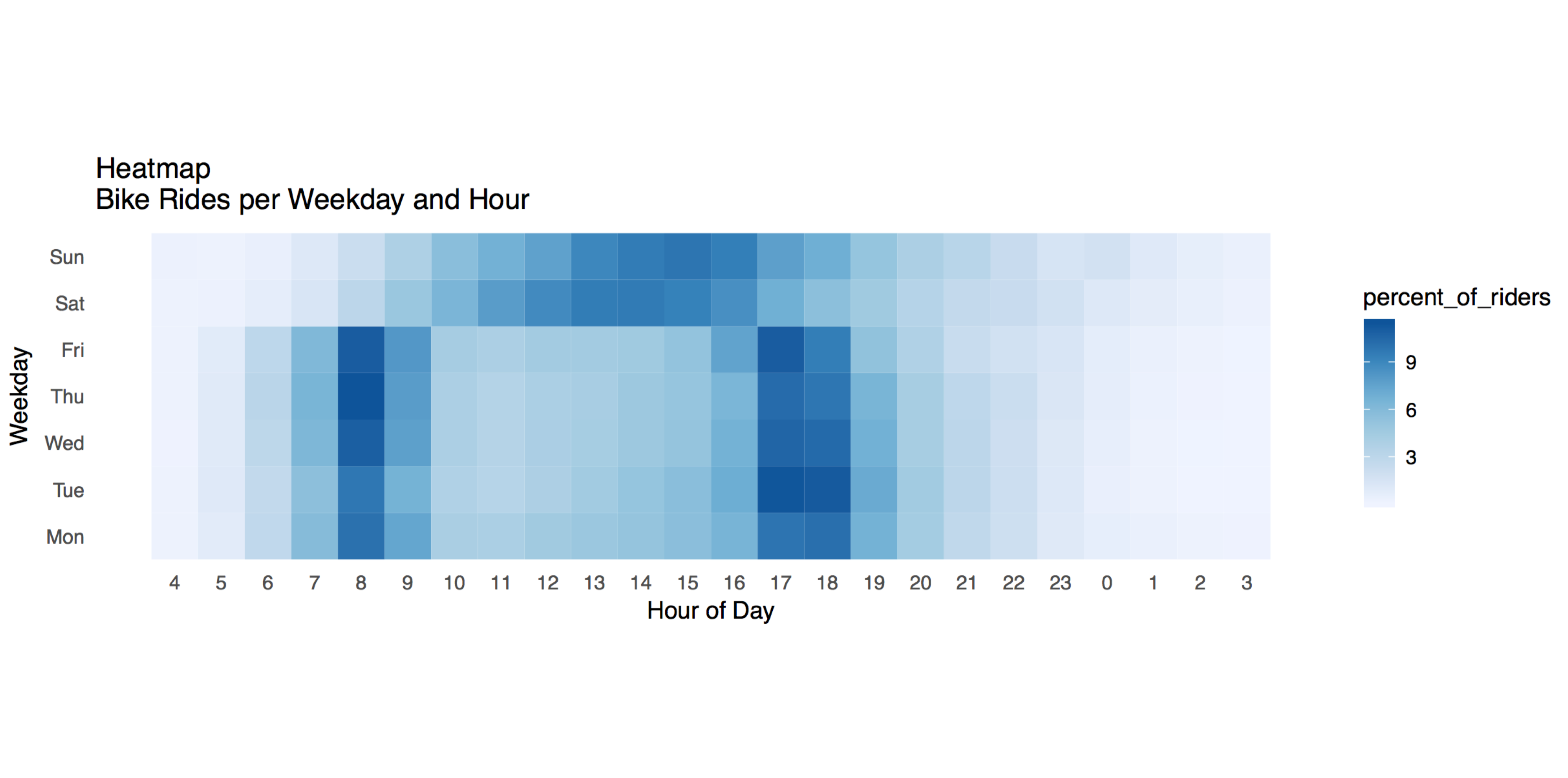
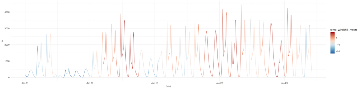
One of the more interesting patterns, that we discovered in the dataset are the two daily peaks (morning and evening commute) as well as the very low number of bike rides in the first week of january because of very cold weather conditions. To better show these patterns over time we went a bit further and produced the following two visualisations:
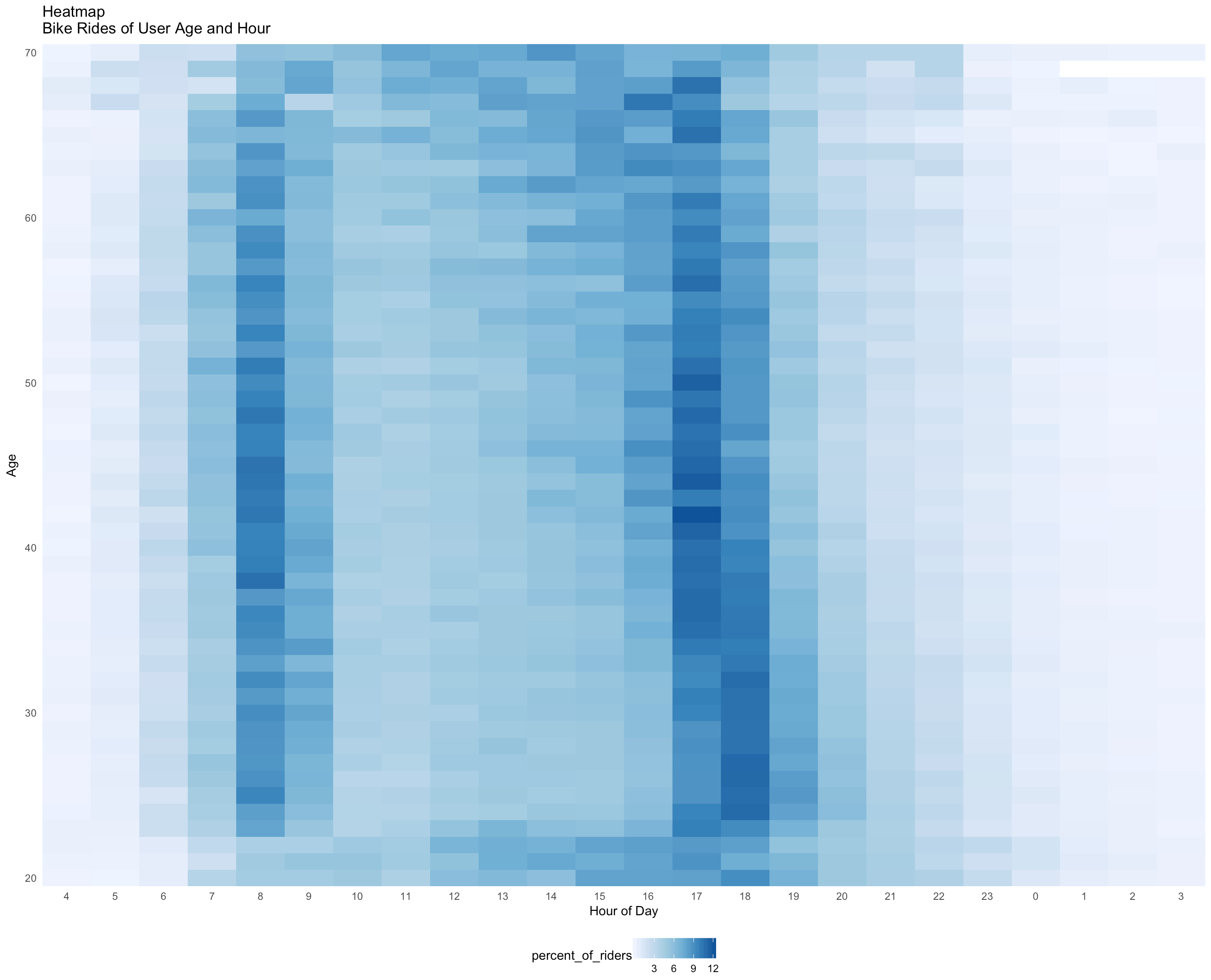
The last visualisation that gives very interesting insights into our data is one concerning age and hour of day. The pattern made visible here is something one would expect, but we did not think that it would be this easily visible: After a certain age, people tend to work shorter days and up to a certain age (seems to be around 25) a lot of young people are still doing their studies, so they do not take part in the daily commute.
Step 4: Main Challenges
To make our r application interactive, we will use shiny which should provide all the functionalities needed.
As it looks right now, these are the challenges we have to solve in order to make our project work:
- On-the-fly (OTF) clustering of pie charts to prevent overlap when zooming out. Problem: takes to long to perform on-the-fly and loading a new dataset for every zoom level will slow down the application and make it unusable.
- OTF statistics over all the shown pie charts (age distribution, trip duration, etc.). Plan B: Provide statistics just for clicked pie chart (on demand, means the overall performance should be better). Problem: If data is aggregated for every station (~650) we loose the detailed data on the single trips (~720'000), which makes it impossible to display statistics (ie histograms) in high resolution.
- Find a working visualisation for the pie charts to make discrimination between clustered or single pie charts intuitive. Problem: if there is no indication if a pie chart is an aggregated one or not, one would have to unnecessary zoom into the map to find out if it is a clustered pie chart or not. In the worst case scenario one would never zoom in and therefore never see how a pie chart is split into several smaller pie charts.
We could solve all the challenges mentioned above by using hierarchical clustering as well as a polygon draw functionality in leaflet for area selection. The problem is, as mentioned not the clustering, but the implementation of the result. The used CRAN package to draw pie charts (leaflet.minicharts) does not support a clearMinicharts() method, which makes it impossible to remove already drawn pie charts. Therefore we decided to step back and—instead of implementing the non-sense clustering function in leaflet—to leave our stations unclustered. To still make the map easy readable, which was the basic idea behind the clustering, we designed a function that scales the pie charts according to the map zoom level (by increasing their size on higher zoom levels).
Step 5: Design Considerations
As the main focus of this project is geovisualisation, this section covers the main thoughts that went into our final design.
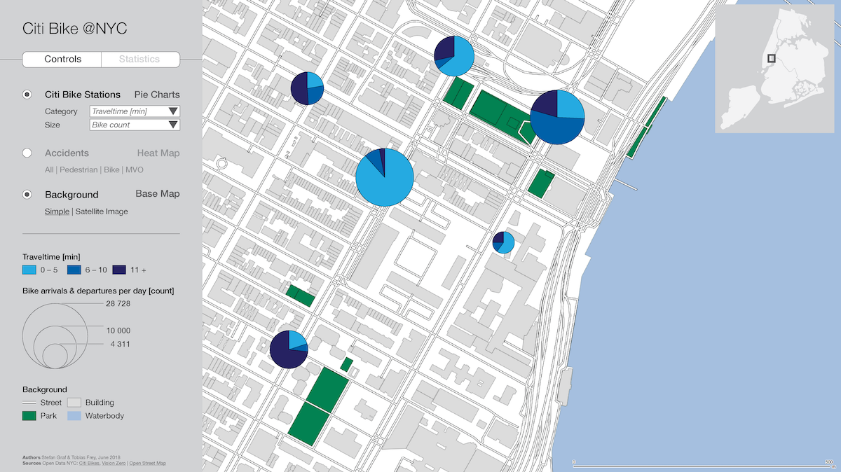
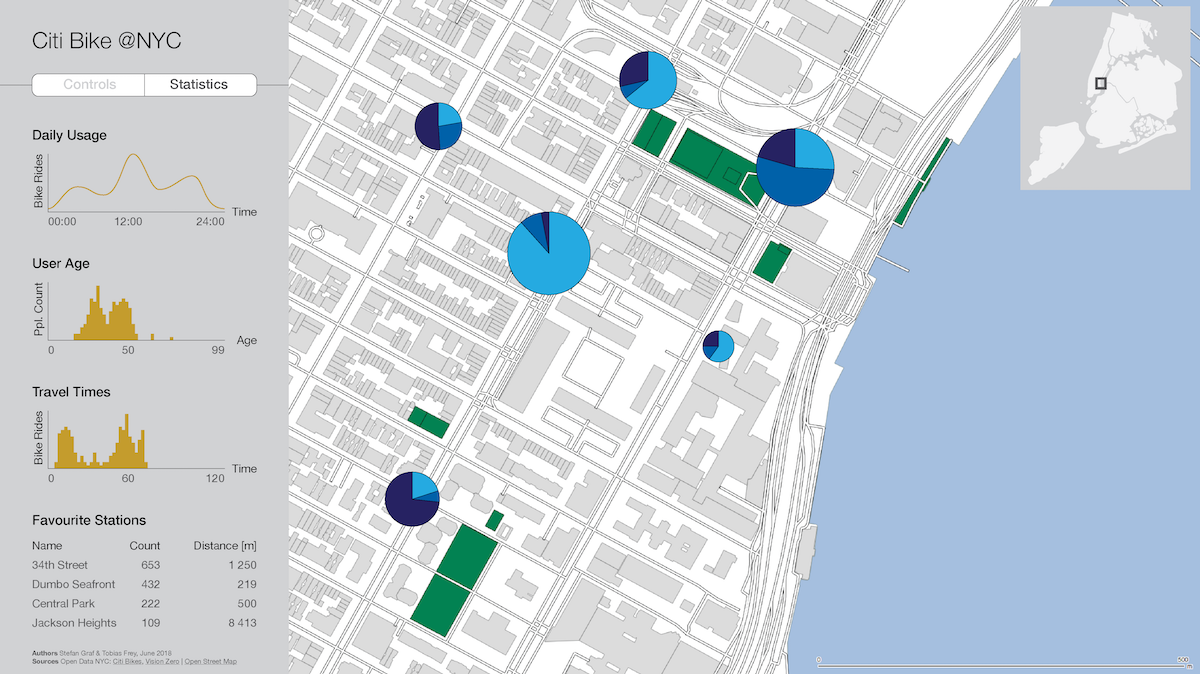
Layout The application is split into three main parts: (1) Control panel on the left, (2) Main map in the center and (3) the statistics panel on the right (for mobile users the application is rendered different, showing the parts one after the other when scrolling down).
The idea here is, that all the controls (change pie chart data, change background layers, filter for specific times and dates, …) are close together, located in the left/topleft region which is the area where most readers/users would look first. As the main attention should be focussing on the map we placed it in the center, which also helps dividing the control (left) and the statistics (right) panel.
Visualisations & Statistics The number of possible statistics and visualisations we could show in our statistics panel on the right are endless. We decied to include four relatively general ones: (1) Trip count over selected dates, (2) trip count over selected hour of day, (3) mean user age over hour of day as well as (4) trip count by distance. There is already a lot of interesting patterns, that can be seen in these visualisations: go look for the weekends in the first plot or compare the mean age inbetween Queens and the Upper Eastside. And we should not forget our focus here, sustainable transport. This becomes especially clear if you look at some weekdays in the Midtown Manhattan area, where two massive peaks show the daily commuter activity.
To give some general information that in some ways could be found in the charts, but is very hard to extract, we also included two short sentences in the top that inform the user on the sample size she/he choose with the 'Polygon Draw' tool.
User Interface & Experience Our main focus in designing this application is its usabilty. How can we break our user interface down to the most important controls? What parts can or should we hide and where do we place them?
We solved these questions by grouping our elements by inputs (control panel on the left) and outputs (main map as well as statistics panel on the right). Every input that is not directly related to a specific element (i.e. the 'Y-Axis fix' option for the plots or the 'Remove Polygon(s)' button that is directly tied to the statistics shown) is placed in the left panel. Here you find the category selection for the pie charts, the date/time filters, size controls as well as the option to change the background map. For first time users we also included a very short introduction to our application, although we hope the user interface (UI) is designed in a way that it does not need a lot of explanation or training. Because "a user interface is like a joke. If you have to explain it, it’s not that good" (@martinleblanc, twitter). To get some feedback on our design early prototypes as well as the final application were given to peers and family to play around. We then used their feedback as well as our observations while they were navigating the application, to further improve the user experience (UX).
Several further steps were undertaken to improve the UX. First, our sliders are watched by a javascript that only updates the values if the user lets the slider go. This speeds up performance (as intermediate calcuations for every step are skipped) and reduces the redrawing of plots to a minimum. Second, the viewing area of the map as well as the zoom levels are limited, so the user can not just zoom in or out and get lost somewhere else in the world. In case the user still gets lost, there is a zoom-out button in the map controls that resets the map to the initial view. Third, by hiding controls that can not be used (i.e. the date slider if 'Date & Time Filter' is unchecked) we limit the UI to things that actually have an visible impact on the main map as well as the visualisations. This is also the reason, why the statistics panel on the right only shows data if a polygon has been drawn on the map. As soon as the polygon is deleted, the panel also goes back to blank.
Color All the colors are based on ColorBrewer (colorbrewer2.org) color schemes and sligthly adjusted to match with the overall design. The whole application works for each of the three most common types of color blindness: Deuteranopia, Protanopia and Tritanopia (tested with ColorOracle, colororacle.cartography.ch). As there are no specific colors associated with our variables (i.e. age) we choose green as our main colors in the pie charts, as it is known to be a color that is perceived as 'calm' (at least in the context of the western world).
Pie Chart Instead of focusing on single values (i.e. user age mean) our goal was to also show the distribution within a category (age). By classifying our variables (age, trip duration, trip distance) into four classes for each station we can do exactly this. Two main thoughts went into the design of the pie charts and their associated legend.
First, there is no legend for the size of the pie charts, as this is an interactive tool where users can just click on a pie chart and get detailled information on its class values. The size of the pie charts always shows the total number of bike trips leaving a station at the choosen date and time range. The are of the pie charts is proportional to this count. On purpose we decided to not implement the flannery compensation, following the negative critique of Edward Tufte in 'The Visual Display of Quantitative Information', 1998 that one should "tell the truth about data" (read more here).
Second, the color legend is custom designed and programmed to always show the min/max values of the displayed data and uses all the expected microtypography features (en-dashes in ranges, thousand separators, comma instead of point).
Main Map The main map serves two functions: it is the background for our citi bike stations as well as the spatial queries (with the 'Polygon Draw' tool. We opted for a very simple, low-contrast, greyish map that still contains some color information on green areas and water bodies. If street categories are an important Factor, there is a second basemap that can be activated in the control panel. Last but not least, to give the user some context an interactive inset map as well as a scale bar were integrated.
There is a lot more we could add here, but writing down every problem we solved, this page would go on for quite a while. A short behind-the-scenes glimpse:
Having a time slider that goes from 0:00–24:00, because this is what a person would define as a full day, and based on this render plots by hour of day. See the problem? 24:00 is the same as 0:00 of the next day … so how do you filter for this data? Do you even have to include it or do you better limite the time slider to 0:00–23:00? We decided to keep it at 0:00–24:00 and do everything possible to find a solution for our plots. It worked out quite well, except for the mean user age plot. Just set a very short time span, i.e. 3 hours and see what happens. Well, there should always be space for improvement.
Drawing polygons on the map is great to get an area of interest. The problem is only: how could you get rid of them without having to reload the whole map (which would be bad for the user experience)? To solve this, several functions on the server side of our shiny application were implemented. There is a counter for the number of drawn polygons listening for 'draw stop' events, that is set back to 0 as soon as the 'Delete Polygon(s)' button is pressed. Sounds easy, not? But this is just where the real problems start. User drawn content is attached a random uniqe layer id which needs to be known in order to actually delete it. Once again, a function is implementend that gets these ids as soon as a new polygon is drawn and stores them. Now we know how many polygons are visible on the map and by using some javascript (because the drawn shapes are not yet accesible via the leaflet layer manager) we can delete the polygons. Simple task, rather difficult (but still elegant) solution. Unfortunately this is the case with a large number of issues we had to solve. R, leaflet and shiny are great, but only to a certain level, after that, there seems to be only javascript and in some cases html and css (application layout).
Wrap up
This last section is a discussion of our results.
We analyse to what degree the proposal could be implemented, what further improvements could look like and highlight some unsolved issues.
Proposal
Looking back at our proposed application idea (see 'Step 2: Project Proposal') six weeks back there is a few points worth a short discussion:
User Stories As mentioned in the proposal we built our application according to user stories describing what our user should be able to do with our solution. Evaluating our final product with these shows that all the interactions are covered, except maybe for the 'switching layers on and off', but from a UX perspective it seems to make more sense to always at least show a dot per bike station.
Layout We proposed a two row layout where the first row would feature tabs to switch inbetween controls an statistics. While testing this inital layout we found out, that it is rather confusing for users if the controls just disapear (which makes sense, as these are in the other tab). Therefore we decided to go with a three row layout that always shows every active feature (including controls and statistics) to give the user a nice overview of all the options/outputs. The full layout is of course responsive (although UX on small screens—given the large number of options—is rather bad.
Additional Data We proposed the integration of a heat map showing bike accidents. The reason why we dropped this option is a simple one: we only have start and end station for each bike trip, so the only conclusion one could draw is on the relation of bike stations and accidents. As this would not make too much sense, we just ignored this feature.
Color Scheme To perfectly match the appearance of our application with this website we made some changes to the proposed color schemes.
Improvements / Unsolved Issues
While working on this application we came across several topics or issues we think we could have done better. Below is a short overview of these as well as possible solutions.
Clustering By far the most potential lies in the clustering of our bike stations for the different zoom levels. A working solution in terms of data aggregation could be implemented, but not visualized. The used R Package (leaflet.miniCharts) does—by the end of may 2018—not support a method to clear all drawn miniCharts. After countless hours working on this problem, even starting to think about developing it ourselves in javascript, we had to drop this idea. There was just not enough time. Therefore we decided to just make the size of the pie charts scale dependent to partly solve the issue of readabilty.
Performance Wrangling 718'000 bike trips for each user interaction including zoom, pan, change of category or date/time slider(s), takes some time.
Why are we so focused on performance? User experience! The longer one has to wait for something to happen after an interaction (ie change of time slider), the larger is the chance of confusion (why is nothing happening?) and/or frustration (why does it take so long?).
Selecting AOI The user can draw several areas of interest (AOI) and statistics are always shown for the last drawn polygon. We worked on a functionality where the user can click on a formerly drawn AOI which would then trigger the statistics for this particular polygon. This would allow for better comparison inbetween different areas. Unfortunately this was, at least for the time given, over our heads.
Additional Layers As already mentioned, we dropped the idea of an additional layer showing accidents. We still think though, that extra layers could add important information if it comes to finding and interpreting patterns. Possible layers we think might be interesting: Living/working areas, subway lines/stops, bus lines/stops or some sort of indicator for rich/poor neighbourhoods.
Statistics/Visualisations With some more time (and maybe less other modules that also need some attention) we could have implemented many more types of statistics and visualisations. An overview of possible types can be found in the 'Step 3: Data Exploration' section above.
Background Information
This section gives an overview on the data, literature as well as other ressources that were used along the way.
Data
All the data used in the project:
Geometry
- NYC OpenData (2018): Borough Boundaries. In: https://data.cityofnewyork.us/City-Government/Borough-Boundaries/tqmj-j8zm [23.05.18].
Thematic
- Citi Bike (2018): System Data. In: https://www.citibikenyc.com/system-data [10.04.18].
- The City of New York (2018): Vision Zero Data Feeds. In: http://www.nyc.gov/html/dot/html/about/vz_datafeeds.shtml [10.04.18].
- Weather Underground (2018): Central Park, NY. In: https://www.wunderground.com/history/airport/KNYC/2018/1/1/DailyHistory.html [23.05.18].
Imagery
- Header Image: Citi Bike (2018): Day Passes. In: https://www.citibikenyc.com/pricing/day [25.04.18].
- Favicon: Metro Bike Share (2018): Favicon. In: cropped-metro-bike-share-favicon-1.png [26.04.18].
![cropped-metro-bike-share-favicon-1.png [26.04.18]](cropped-metro-bike-share-favicon-1.png)
R Packages
The following R Packages were used in creating the plots shown above as well as the whole shiny application:
shiny, shinycssloaders, leaflet, leaflet.extras, leaflet.minicharts, RColorBrewer, lubridate, data.table, readr, dplyr, scales, tidyverse, sp
Web Ressources
This is a collection of important websites as well as specific building blocks in html, css and javascript we used to build this website as well as our interactive map application:
Links
- w3schools.com: Sticky Navbar. In: www.w3schools.com/howto/howto_js_navbar_sticky.asp [11.04.18].
- w3schools.com: Fixed Footer. In: www.w3schools.com/howto/howto_css_fixed_footer.asp [11.04.18].
- Holtz,Yan (2017): The R Graph Gallery. In: https://www.r-graph-gallery.com [24.05.18]
- RStudio Inc. (2017): Gallery. In: https://shiny.rstudio.com/gallery/ [27.04.18].
Literature
An overview of literature we read and based this project on:
Thematic
- Banister, David (2008): The sustainable mobility paradigm. In: Transport policy, 15(2), p. 73-80.
- Ahern, J. (2013). Urban landscape sustainability and resilience: the promise and challenges of integrating ecology with urban planning and design. In: Landscape Ecology, 28(6), p. 1203-1212.
- Collier, M. J., Nedović-Budić, Z., Aerts, J., Connop, S., Foley, D., Foley, K., ... & Verburg, P. (2013). Transitioning to resilience and sustainability in urban communities. In: Cities, 32, p. 21–28.
- Kenworthy, J. R. (2006). The eco-city. Ten key transport and planning dimensions for sustainable city development. In: Environment and urbanization, 18(1), p. 67-85.
- Pucher, J., & Dijkstra, L. (2003). Promoting safe walking and cycling to improve public health. Lessons from the Netherlands and Germany. In: American journal of public health, 93(9), p. 1509-1516.
- Sietchiping, R., Permezel, M. J., & Ngomsi, C. (2012). Transport and mobility in sub-Saharan African cities: An overview of practices, lessons and options for improvements. In: Cities, 29(3), p. 183-189.
- World Bank (2002): Cities on the Move. A World Bank Urban Transport Strategy Review . World Bank, Washington DC. In: https://openknowledge.worldbank.org/handle/10986/15232 [30.05.18].
Cartography
- Slocum, Terry A. / Mcmaster, Robert B. / Kessler, Fritz C. / Howard, Hugh H. (2009): Thematic Cartography and Geovisualization. Pearson New International Edition.
- Roth, Robert E. / Ross, Kevin S. / MacEachren, Alan M. (2015): User-Centered Design for Interactive Maps: A Case Study in Crime Analysis. In: ISPRS International Journal of Geo-Information 4, p. 262–301.
- Andrienko, Gennady / Andrienko, Natalia / Demsar, Urska / Dransch, Doris / Dykes, Jason / Fabrikant, Sara I. / Jern, Mikael / Kraak, Menno-Jan / Schumann, Heidrun / Tominski, Christian (2010): Space, time and visual analytics. In: International Journal of Geographical Information Science 24(10), p. 1577–1600.
Inspiration
This section gives an overview of—at least from our point of view—great websites, interactive data tools, web maps and anything else related to this project. Feel free to check out these fantastic works of art and give these people credit for their work:
Tools
- Brewer, Cynthia: Color Brewer 2.0. In: http://colorbrewer2.org [12.04.18].
- Jenny, Bernhard: Color Oracle. In: http://colororacle.cartography.ch [18.04.18].
Applications & (Interactive) Maps
- earth nullschool. In: https://earth.nullschool.net/ [18.04.18].
- Pinterest: Collection of NYC bike maps and visualisations. In: https://www.pinterest.de/pin/142567144434136664/?lp=true [30.04.18].
- Schöley, Jonas (2016): Human Mortality Explorer. Shiny Application. In: https://jschoeley.shinyapps.io/hmdexp/ [10.04.18].
- Guerriero, Michael (2013): Interactive. A Month of Citi Bike. In: The New Yorker. https://www.newyorker.com/news/news-desk/interactive-a-month-of-citi-bike [24.04.18] as well as https://projects.newyorker.com/story/citi-bike.html [25.04.18].
Everything else …
- Information is beautiful Awards. In: https://www.informationisbeautifulawards.com/ [18.04.18].
- Thorp, Jer (2012): Make data more human. TED Talk. In: https://www.ted.com/talks/jer_thorp_make_data_more_human [17.04.18].
- Mccune, Dough(2011): Visualizing Cyclical Time – Hour of Day Charts. In: http://dougmccune.com/blog/2011/04/21/visualizing-cyclical-time-hour-of-day-charts/ [05.04.18].