Animated Point Map
Maps - Click on the map
The following animated maps show all Uber pick-ups during the two chosen time-frames in New York City and its sourroundings. The first map shows pick-ups from Thursday 03.07.2014 02:00 to Friday 04.07.2014 02:00. The second map shows pick-ups during the same time-frame but two weeks later and therefore from Thursday 17.7.2014 02:00 to Friday 18.7.2014 02:00. We chose these four days as we wanted to investigate the influence of holidays on Uber pick-ups. Therefore we chose the 4th of July, which is the independence day of the United States of America and is a federal holiday.
Data and processing
The dataset contains 35'745 pick-ups for the week of the 4th of july and 60'570 pick-ups two weeks later. On thursday before the 4th of july 21'597 pick-ups were registered against 29'860 pick-ups on the thursday 17.7.2014 two weeks later, a usual working day. On friday the 4th of july 14'148 were registered against 30'710 pick-ups two weeks later. Furthermore for each pick-up the time and the location in latitude and longitude were registered. This enabled us to represent each pick-up as a point on a map and uploading the data to CartoDB enabled us to build an animated map over space and time. We used the used the function "heatmap" provided by CartoDB to visualize the data. Uncertainties and considerations about this function are discussed below in the part "Uncertainties".
After a first animation we were unsatisfied with the speed of the animation. In order to slow down the animation we tripled each pick-up location and assigned a new time value that is 20, respectively 40 seconds later to the original one. Therefore, the animation shows each pick-up over longer time and the animation slows down, which allows better analysis and enhances comparisons between the two datasets.
Before we present our interpretation and discussion, please have a look by yourself on the outcome! You can zoom in and out and select time sections for each map or interrupt the animation by clicking on the play button. If you want to re-run both maps synchronous just refresh the whole page. Be aware that date and time are represented in US-format in the time-slider. Furthermore the small yellow histogramm indicates how many Uber pick-ups were registered at one specific moment within the map extract.
Maps - Click on the map
Point data animation
03.07.2014 - 04.07.2014 (35'745 pick-ups)
17.7.2014 - 18.07.2014 (60'570 pick-ups)
Results, Interpretation and Discussion
First of all it must be stated that these animations are a nice way to get an overview of the data and are attracting attention. However these maps are less usable to conduct serious analysis, therefore we created two choropleth maps. Nevertheless some the animated maps open room for some first interpretations.
Results
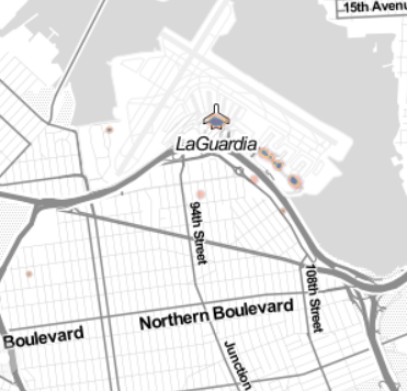
First thing to mention is, that we found nearly 25'000 pick-ups more in the second time-frame (17.7 - 18.7.2014). Especially on the holiday (4.7.2014) we found nearly 15'000 pick-ups less than two weeks later. Also the day before the holiday less pick-ups were registered compared to the same weekday two weeks later (21'597 against 29'806). The maps show that by far most pick-ups occur in Manhattan but also the surrounding airports are frequented regularly over time. Furthermore we register more pick-ups during the night of the 17th to the 18th of july. But most obvious is the low rate of pick-ups during the day of holiday.
Interpretation
It seems that holidays affect the numer of Uber pick-ups. These might be due to the institutional organization of Uber, as the drivers are free to choose when they work. Drivers might favour spending the holiday without working for Uber. Another explanation could be that Uber-rides are less asked on a holiday. That would imply that Uber-rides are more used during work-time than during free-time and thereby used as a transport service for commuting. Unfortunately, we do not know where each ride ended, but as most pick-ups occured in Manhattan one could assume that people living in Manhattan use Uber as a substitute for traditional yellow cabs or the subway. The lack of pick-ups during the night of the 3rd to the 4th of july could be explained as a lot of people might use the occassion of the weekend to leave New York City.
Uncertainties
Unfortunately, we could not find any documentation about how this "heatmap" is calculated and whether or not it is density-based. The only parameters, which seem to have crucial influence on the representation are called "Trails" and "Value". After playing around with the provided parameters, we assume that the heatmap is not density-based as no spatial distance respectively bandwidth must be set, as for example in a Kernel Density map. However, we guess that the heatmap gets more intense if the point representation of a pick-up overlaps with the representation of an other pick-up. Therefore one could argue it is a density-based map but not spatial-dependent but representation-dependent.